Short answer: The most costly UI/UX mistakes are invisible to the team but obvious to users — confusing navigation, unclear CTAs, broken mobile experiences, slow load times, and ignoring user feedback loops. Each one bleeds customers silently. A UX audit surfaces these in 1-3 weeks before they compound. (Further reading: NN/g — 10 Usability Heuristics.)
Last updated: June 10, 2026
17 min read · 3,718 words
Introduction: The Silent Revenue Leak Nobody Talks About
Most businesses can identify when their marketing is underperforming. A campaign falls flat. Ad spend does not convert. Email open rates decline. These failures are measurable and visible. There is, however, a category of business failure that is far harder to see — and often far more costly. Users arrive at your product, your website, or your application. They look around for a few seconds. And then they leave. They do not complain. They do not fill in a feedback form. They simply go somewhere else and never come back.
The cause of that silent departure is almost always a UI/UX design problem. A navigation that does not behave as expected. A form that asks for too much. A page that loads too slowly on a mobile device. A call to action that is present but not compelling. None of these failures are dramatic. Each one is, by itself, a minor friction point. But friction accumulates. Across a week of users, a month of sessions, and a year of business operations, even small user experience failures represent meaningful lost revenue.
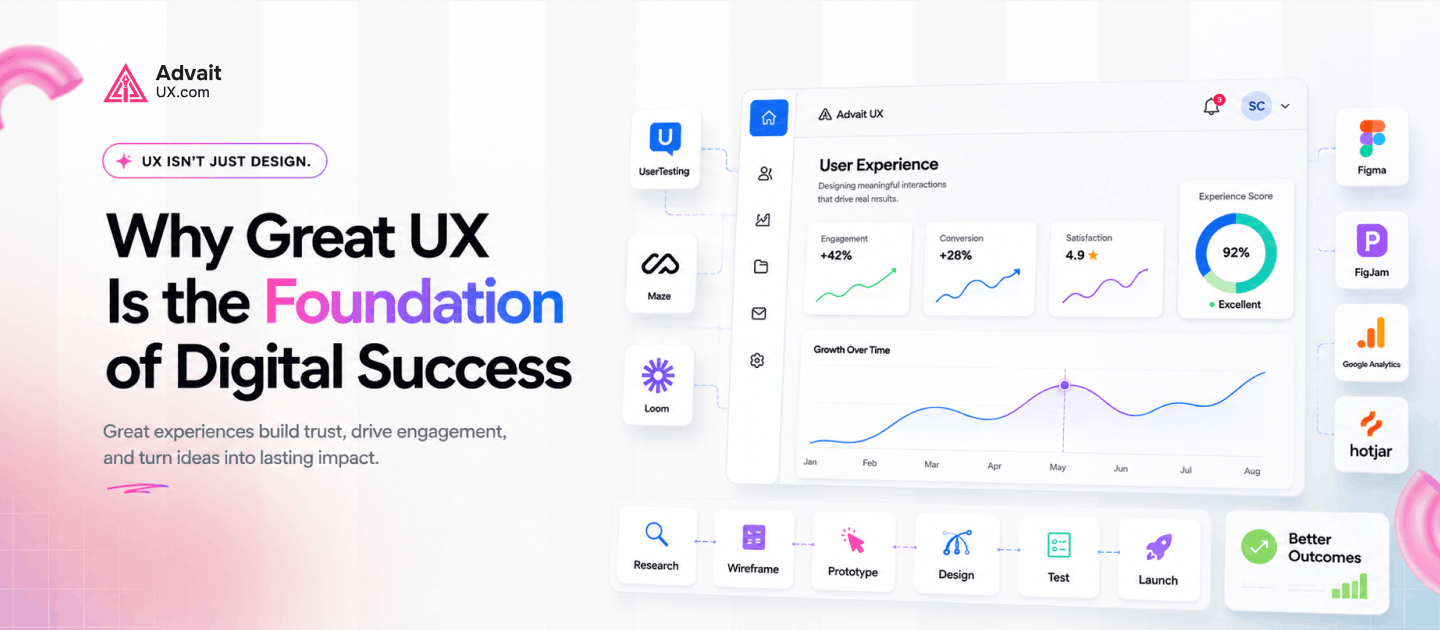
This article identifies the most damaging UI/UX Mistakes that businesses make — and explains specifically why each one drives customers away. It also explains what genuine UX UI Mastery looks like in practice, and how addressing these mistakes systematically produces measurable improvements in the metrics that actually matter.
What this article covers: The most costly UI/UX mistakes in modern digital products. The psychology and research behind each failure. How these mistakes compound over time into significant revenue loss. What fixing them actually requires. And how to evaluate whether your current product is suffering from any of them.
The Scale of the Problem: What Poor UX Actually Costs
Before addressing specific mistakes, it is worth establishing the scale of what poor User Experience costs in concrete, measurable terms. The numbers are consistently larger than most business leaders expect — and they come from research conducted across industries, product types, and user demographics.
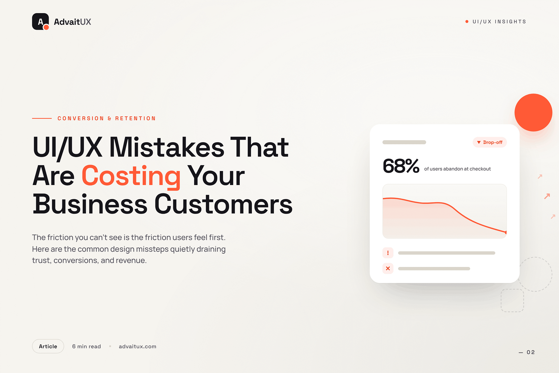
According to Forrester Research, every dollar invested in UI/UX design service returns up to one hundred dollars in revenue. The inverse is equally true: every dollar lost to poor UX compounds — because the user who leaves does not simply represent one lost transaction. They represent a lost relationship, a lost referral, and a lost lifetime customer value. The Baymard Institute has documented that the average e-commerce cart abandonment rate sits at approximately 70 percent — the majority of which is attributable to UX friction rather than price concerns or genuine disinterest in the product.
The mobile dimension makes this more urgent. Google’s research on mobile experience shows that 53 percent of mobile users abandon a page that takes longer than three seconds to load. On a product where mobile traffic represents the majority of sessions — which is now true across most consumer-facing categories — a slow, friction-heavy modern web design is not just a usability problem. It is a structural revenue problem.
What makes these statistics genuinely alarming is that the businesses suffering the most significant losses are often unaware of the cause. They see the bounce rate. They see the abandonment rate. They see the churn metric. But without the lens of UI/UX Mistakes in reducing customer friction as a discipline, they misattribute the cause — investing in more marketing to fill a bucket that has holes rather than fixing the holes first.
“A bad user experience doesn’t just lose you a sale. It loses you a customer, their network, and every future transaction they might have made.”
Mistake 1: Slow Load Times That Users Will Not Wait For
Speed is not a technical feature. It is a Websites with UX Design fundamental. Users have no tolerance for waiting in a world where the fastest alternative is one tap away. The relationship between load time and user behaviour is one of the most extensively documented findings in digital product research. The numbers are unambiguous, and they get worse as speed decreases.
According to Google’s Core Web Vitals documentation, pages loading in one second convert at a rate three times higher than pages loading in five seconds. The drop-off is not linear. It is steep. A user waiting five seconds is not simply slightly more frustrated than one waiting one second. They are operating in a fundamentally different psychological state — one of doubt, impatience, and reduced confidence in the product they are about to encounter. That state carries forward into the session even if the page eventually loads.
The most common causes of slow load times in web products are entirely within design and development control. Unoptimised images are the single largest contributor — a high-resolution hero image served without compression can add three to four seconds to a page load on a typical mobile connection. Render-blocking scripts, excessive third-party integrations, and poorly structured CSS all compound the problem. None of these require dramatic product changes to fix. They require the kind of disciplined technical attention that a serious UI UX design agency applies as standard practice rather than an afterthought.
Fixing load performance is consistently among the highest-return improvements any digital product can make. Unlike feature development, which introduces complexity, performance optimisation reduces it. Faster products are also simpler products — with less code, cleaner architecture, and more intentional content hierarchies. The investment in speed is an investment in every other aspect of the user experience simultaneously.
Mistake 2: Navigation That Confuses Instead of Guides
Navigation is the most fundamental wayfinding system in any digital product. When it works well, users are not aware of it. They simply move through the product with confidence, finding what they need when they need it. When it fails, the entire product fails — because a user who cannot find what they are looking for will not persist long enough to discover whether the product itself is good.
The most common navigation failures share a specific characteristic: they are designed from the organisation’s perspective rather than the user’s. Navigation labels that use internal terminology, information architectures that mirror departmental structures, and menu systems that prioritise what the company wants to say over what the user wants to find are all symptoms of the same underlying problem. The Nielsen Norman Group has documented extensively that navigation cognitive strain — the mental effort required to locate information in a poorly structured system — is one of the primary drivers of user abandonment in web products.
Mobile navigation compounds these problems. Desktop navigation patterns that rely on hover states, multi-level dropdowns, or dense menu structures become completely unusable on a touch screen. A modern web design approach that does not begin with mobile navigation as the primary design constraint will consistently underperform on mobile — which, for most businesses, means underperforming for the majority of their traffic.
The fix requires genuine UX Solutions— specifically, card sorting research and tree testing with real users to establish how they naturally categorise and search for information. These are not expensive or time-consuming processes. They are the foundational research methods that separate navigation designed by assumption from navigation designed by evidence. A UI/UX Mistakes this research the starting point rather than an optional validation step.
Mistake 3: Forms That Ask Too Much and Give Too Little
Forms represent the most critical conversion moment in most digital products. A checkout form, a registration flow, a contact form, a lead capture — each is a moment where user intent and business goal meet. The design of that meeting determines whether it produces a conversion or an abandonment. Most forms are significantly worse designed than the rest of the products they appear in. The gap between form quality and overall product quality is one of the most consistent findings in UX Research .
The primary failure is asking for too much information too early. According to the Baymard Institute’s form usability research, the average checkout form contains 14.88 fields — but the optimal number for most e-commerce contexts is between 7 and 8. Every additional field is a friction point. Every unnecessary question signals to the user that the organisation values its own data collection needs above the user’s time. That signal is corrosive to trust, and trust is the prerequisite for conversion.
Error handling is the second major form failure. Forms that display generic error messages — “Something went wrong. Please try again.” — without specifying what the user needs to correct produce measurably higher abandonment rates than forms with specific, helpful, inline error messages. According to the Nielsen Norman Group’s form design guidelines, inline validation that catches errors as users type rather than after submission is associated with a 22 percent improvement in form completion rates. This is not a complex feature. It is a fundamental Future of UX Design discipline.
Progressive disclosure — presenting form fields in logical stages rather than as a single overwhelming block — is the third lever that most businesses have not yet pulled. Breaking a ten-field registration form into three steps of three to four fields each consistently improves completion rates. Users perceive the task as smaller, maintain momentum, and rarely abandon partway through a multi-step flow once they have invested effort in the first step.
Mistake 4: A Mobile Experience That Feels Like an Afterthought
Mobile is not a secondary channel for most businesses. It is the primary one. Statista’s global web traffic data shows that mobile devices account for approximately 60 percent of global web traffic. In consumer-facing e-commerce, that figure is often higher. A modern web design strategy that treats mobile as a scaled-down version of a desktop experience — rather than as the primary design context — is building for a minority of its audience while ignoring the majority.
The most damaging mobile UI/UX Mistakes failures are predictable and well-documented. Touch targets that are too small produce mis-taps, frustrated users, and immediate abandonment. The Apple Human Interface Guidelines recommend a minimum touch target size of 44 by 44 points. Many product interfaces fall significantly below this standard, particularly in navigation elements and form inputs. On a device operated with a thumb, accuracy has physical limits. Design must accommodate those limits rather than expecting users to adapt to them.
Text legibility on mobile is the second persistent failure. Font sizes that are comfortable on a desktop monitor become strained reading on a device held at arm’s length in variable lighting conditions. A 14-pixel body text size that looks fine in a desktop browser can be genuinely difficult to read on a phone screen without zooming. The standard recommendation from the Web Content Accessibility Guidelines is a minimum of 16 pixels for body text — a baseline that a surprising number of mobile implementations still fail to meet.
A genuine mobile-first approach in UX Design Audit does not simply apply responsive CSS to a desktop layout. It begins with the mobile context as the design constraint — small screen, touch input, variable connectivity, divided attention — and builds upward from there. Products designed this way feel natural on mobile rather than tolerated. The difference in UI/UX Mistakes quality is immediately apparent to any user who encounters both types.
Mistake 5: Calls to Action That Fail to Convert
A call to action is the moment of decision in any digital product. It is the point where a user’s interest either converts to commitment or evaporates into a closed tab. The design of that moment — the text, the placement, the visual weight, the surrounding context — has a disproportionate impact on business outcomes relative to the effort required to get it right. Yet calls to action are consistently among the most under-designed elements in digital products.
The most common failure is generic language. “Submit,” “Click here,” “Learn more,” and “Get started” are phrases that tell users nothing specific about what will happen next. Ambiguity at the moment of decision produces hesitation. Hesitation produces abandonment. According to HubSpot’s conversion rate research, personalised calls to action — those that speak directly to what the user gets by clicking — convert 202 percent better than generic ones. That is not a marginal improvement. It is the difference between a product that converts and one that does not.
Visual hierarchy is the second major CTA failure. A call to action that competes visually with surrounding elements for attention is not functioning as a primary action. It is functioning as one option among many. UX in Reducing Customer decision friction requires that primary actions be visually unambiguous — elevated above secondary actions through size, colour, contrast, or spatial positioning. When everything on a page looks equally important, nothing is important. Users require a clear visual path to the next step, and it is the design’s responsibility to provide one.
Context around the CTA matters as much as the CTA itself. Social proof — testimonials, review counts, trust badges — placed adjacent to primary conversion actions consistently improves conversion rates. The proximity of evidence of trust to the moment of decision reduces the user’s perceived risk of committing. This is not manipulation. It is UI/UX Mistakes applied to the specific psychological moment where conversion happens. Getting it right is one of the highest-leverage improvements any digital product can make.
Mistake 6: Treating Accessibility as Optional
Accessibility is not a niche concern for a small minority of users. According to the World Health Organization, approximately 1.3 billion people globally live with some form of disability. That includes visual impairments, motor difficulties, cognitive differences, and hearing loss — all of which affect how people interact with digital products. A UI UX Design Agency that does not account for this range of users is not just failing ethically. It is excluding a significant portion of its potential market.
The most common accessibility failures in digital products are low colour contrast, missing alternative text on images, non-keyboard-navigable interfaces, and form inputs without visible labels. Each of these failures makes the product genuinely unusable for specific categories of users. Low contrast text is invisible to users with low vision. Missing alt text makes image content inaccessible to screen reader users. Non-keyboard-navigable interfaces exclude users with motor impairments who rely on keyboard navigation. These are not edge cases. They are everyday barriers experienced by real customers.
The Web Content Accessibility Guidelines (WCAG) 2.1 provide a clear, internationally recognised standard for accessible digital design. Meeting the AA conformance level — which covers the most significant barriers for most users — is achievable without compromising aesthetic quality or product functionality. In fact, many accessibility improvements improve the experience for all users. Higher contrast improves readability in bright sunlight. Keyboard navigability improves efficiency for power users. Clear form labels reduce errors across all demographics.
A best UI/UX Mistakes does not treat accessibility as a compliance checkbox. It treats it as a design quality standard. Products that meet accessibility requirements are better products — more usable, more trustworthy, and more welcoming to a broader range of customers. Excluding accessibility from a UI/UX design service engagement is not a cost saving. It is a market exclusion decision.
Mistake 7: Inconsistency That Erodes User Trust
Visual and interaction consistency is one of the most undervalued aspects of user experience. Users build a mental model of how a product works based on their early interactions with it. They learn which colours mean interactive. They learn which patterns indicate navigation. They learn which visual cues signal warnings, successes, and errors. When that mental model is violated — when a button that looks the same as every other button behaves differently, or when the navigation structure changes between sections — users experience a specific kind of cognitive discomfort that erodes confidence in the product.
The business impact of inconsistency is well-documented. According to the Nielsen Norman Group’s research on consistency, violating established UI/UX Mistakes conventions increases error rates, slows task completion, and reduces user confidence significantly. Users who encounter inconsistency in a digital product are not just slightly more confused. They actively doubt whether they understand how the product works — and that doubt reduces their willingness to commit to conversion actions.
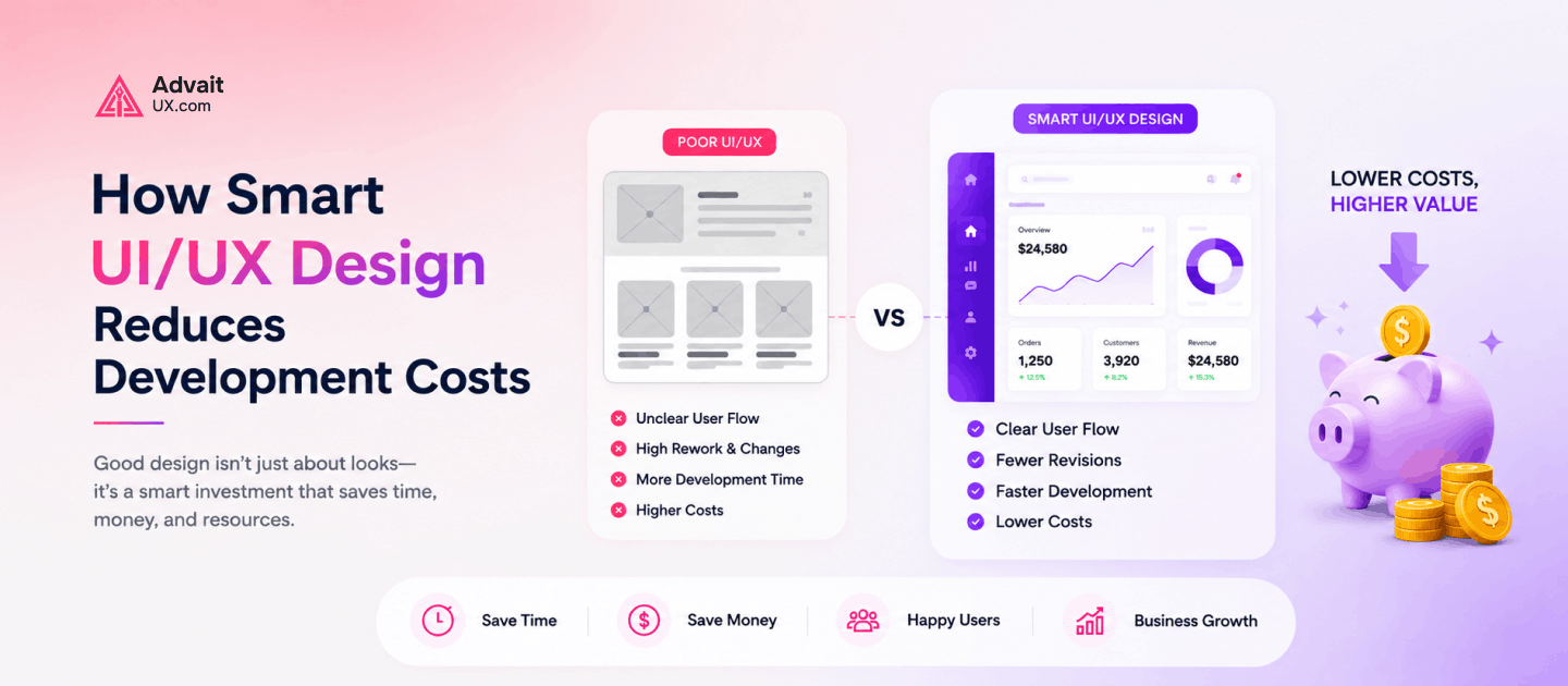
The solution is a design system — a shared library of components, patterns, typographic rules, colour semantics, and interaction behaviours that every part of the product draws from. A well-implemented design system is one of the highest-leverage investments in modern web design quality available. It reduces development time, ensures visual coherence across every screen, and makes future product changes more predictable and less costly. The initial investment in building a design system pays back across every subsequent development sprint.
For businesses whose products have grown organically without a coherent design system, the audit process that precedes system implementation is itself valuable. Mapping every inconsistency, identifying every orphaned pattern, and establishing a clear visual language from that foundation is the kind of work that a specialist UX and UI design impact brings particular expertise to. It is forensic design work — and it produces clarity that compound improvements can be built on.
Mistake 8: Building Products on Assumptions Instead of Evidence
Perhaps the most fundamental UI/UX design mistake is also the least visible: designing without user research. Every product built on internal assumptions about what users want, how they think, and what they find difficult is a product that will surprise its designers with its failures. The assumptions feel reasonable. They are grounded in the team’s own experience of the product. But the team is not the user — and the gap between their experience and the user’s experience is where most costly user experience failures originate.
User research does not need to be expensive or time-consuming to be valuable. The Nielsen Norman Group’s landmark research on usability testing established that testing with five users identifies approximately 85 percent of usability problems in a digital product. Five users. A single afternoon of qualitative testing. The return on that investment is a prioritised list of real problems experienced by real people — rather than a list of features the team thinks users probably want.
Quantitative data from analytics tools complements qualitative research rather than replacing it. Session recordings, heat maps, and funnel analysis all reveal where users struggle — but they cannot explain why. A user who drops off at step three of a checkout flow is visible in the analytics data. Whether they left because the form was too long, because they could not find a promo code field, or because a page error occurred is only discoverable through qualitative methods. Both types of evidence are necessary for genuinely effective UI/UX Mistakes.
Building research into the design process is not a luxury reserved for large organisations with dedicated research teams. It is the minimum standard for any Mobile App UX Design Services engagement that expects to produce products people actually use well. The cost of research is always lower than the cost of building the wrong thing — and then building it again once the real problem becomes apparent.
Key Takeaways
Every UI/UX design mistake covered in this article shares a common characteristic: it is invisible to the business until it is measured. Users do not report slow load times. They simply leave. They do not complain about confusing navigation. They simply find another product. They do not explain why they abandoned the checkout. They simply close the tab. The silence of UX failure is what makes it so persistently costly — and so consistently underestimated.
The eight mistakes identified here — slow load times, confusing navigation, friction-heavy forms, poor mobile experience, weak calls to action, inaccessible design, visual inconsistency, and assumption-based development — are all addressable. None of them require rebuilding a product from scratch.
All of them require the kind of systematic, evidence-driven approach that genuine Principles of UX Design friction demands. Fixing even two or three of them in a single product iteration produces measurable improvements in conversion, retention, and satisfaction.
The research is unambiguous about the return. User experience investment delivers some of the highest ROI available in digital product development — consistently outperforming equivalent investment in marketing, feature development, or brand work for products where UI/UX Mistakes problems are the primary growth constraint. The question is not whether to fix these mistakes. It is which ones to fix first.
Conclusion: The Customers You Keep Are Worth More Than the Ones You Chase
Every UX mistake is ultimately a customer retention failure. The user who encountered a slow page, a confusing navigation, or a form that asked too much did not leave because they stopped wanting your product. They left because your product made them work too hard to get it. That is a recoverable situation — but only if the product improves before they have committed to an alternative.
The businesses that grow most reliably through digital channels share one characteristic: they treat UI/UX design service as a continuous investment rather than a one-time project. They test regularly. They measure user behaviour systematically. They fix friction points before they become abandonment patterns. And they work with partners who bring the Top UI/UX Design Trends required to identify problems that internal teams, too close to their own product, consistently miss.
At Advaitux, the work begins with an honest audit of where your product is currently losing users. Not where you think it is losing them — where the evidence shows it is. Every engagement is grounded in research, structured around measurable goals, and delivered by a team that has spent years understanding how real users interact with real digital products. Whether you are addressing a specific conversion problem, rebuilding a modern web design system from the ground up, or establishing the design infrastructure for a growing product, the approach is always the same: evidence first, solutions second.
The customers your product is currently losing are not lost forever. They are simply waiting for a version of your product that respects their time. Visit advaitux.com to start that conversation.
About Advaitux
Advaitux is a specialist UI UX design agency focused on building digital products that are clear, purposeful, and genuinely easy to use. The team combines deep user research, rigorous information architecture, and precise visual craft to deliver UI/UX design service outcomes that improve real business metrics. Visit advaitux.com to explore case studies and service details.
Working on your own product? Start with a structured UX audit to catch these mistakes before they cost more customers, or get in touch. See our recent UI/UX projects.
Frequently Asked Questions
What are the most common UX mistakes businesses make?
The most common UX mistakes are: unclear navigation that forces users to guess, generic CTAs like ‘Submit’ instead of action-specific labels, broken or cramped mobile experiences, slow page load times (each second costs ~7% conversions), no empty state handling, and ignoring user feedback after launch. Most are fixable without a full redesign.
How do I know if my product has UX problems?
Signs of UX problems: high bounce rates, low conversion on key pages, frequent support tickets about the same features, users dropping off mid-funnel, and low task-completion rates in analytics. A UX audit with usability testing will pinpoint exactly where and why users are failing.
About the Author
Darshan Italiya is the Founder & UX Lead at AdvaitUX, a UI/UX design agency based in Austin, TX. Google-certified UI designer with 7+ years of experience and 70+ shipped product designs. About AdvaitUX | LinkedIn.