Key Takeaways
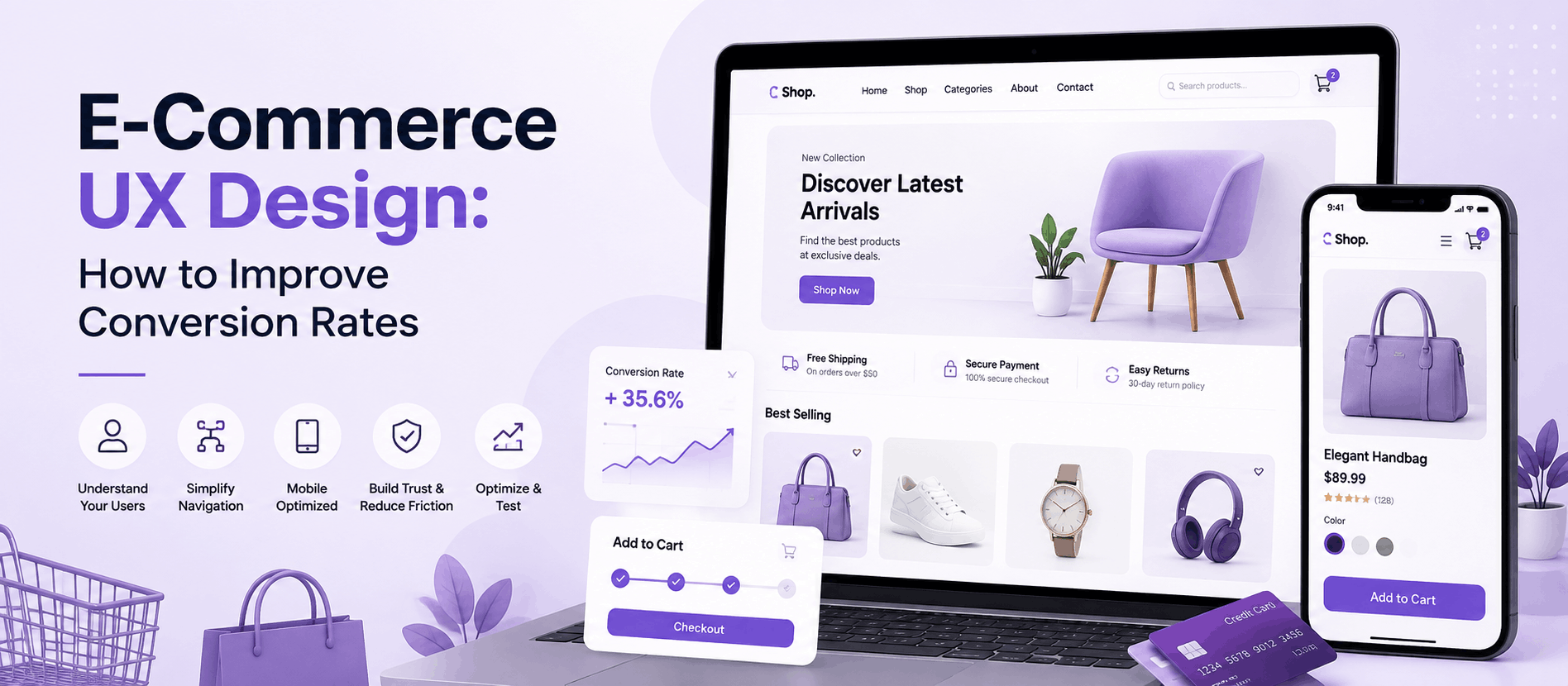
- E-commerce UX design is about removing friction at every stage of the shopping journey, not just improving visual appeal.
- UX directly influences product discovery, evaluation, cart behavior, and checkout completion, all of which feed into conversion rate.
- Product pages and checkout are typically the highest-leverage areas for conversion improvement.
- Mobile UX, site search, and trust signals are frequently underestimated but heavily influence buying decisions.
- Improving UX is an ongoing process built on research, testing, and measurement, not a one-time redesign.
- Tracking the right metrics, such as cart abandonment, checkout abandonment, and product page engagement, helps pinpoint exactly where friction is occurring.
A store can have great products, competitive pricing, and a solid marketing budget behind it — and still lose customers at an alarming rate. Usually, the reason isn’t the product. It’s the experience around it. A visitor gets confused by navigation, can’t find shipping costs until the last step of checkout, or gives up on a product page that doesn’t answer basic questions. That’s friction, and friction is what separates a browsing visitor from a paying customer.
This is where e-commerce UX design comes in. UX design isn’t about making a store look polished — it’s about removing every unnecessary obstacle between “I’m interested” and “I bought it.” And that connection between UX design and conversion rate is direct: the easier and more intuitive a store is to use, the more likely visitors are to complete a purchase, trust the brand, and come back again.
This article breaks down what e-commerce UX actually means, why it matters for conversions, the specific elements that influence buying decisions, common mistakes that quietly kill sales, and a practical process for improving your store’s experience over time.
What Is E-Commerce UX Design?
E-commerce UX design is the practice of shaping how a shopper interacts with an online store — from the moment they land on a page to the moment they check out (and beyond, into post-purchase experience). It covers navigation, layout, content clarity, interaction design, page speed, and every micro-decision a user has to make along the way.It’s easy to confuse this with visual design, but they’re not the same thing.
A store can look beautiful and still have poor UX if the checkout is confusing, the search doesn’t return relevant results, or the mobile experience is clunky. Good e-commerce User experience is functional first and attractive second — visual design supports usability, it doesn’t replace it.
In practice, UX design for e-commerce means constantly asking: does this make it easier for the user to find what they want, understand it, trust it, and buy it? If the answer is no, that’s a UX problem worth fixing, regardless of how the page looks.
Why UX Design Matters for E-Commerce Conversion Rates
Every step in the shopping journey is a decision point, and UX either supports that decision or gets in its way.
Product discovery is the first hurdle: if users can’t find what they’re looking for through navigation or search, they leave. It doesn’t matter how good the inventory is if it’s undiscoverable. Product evaluation comes next — shoppers need enough information, through images, specs, reviews, and sizing details, to feel confident. Ambiguity creates hesitation, and hesitation kills conversions.
Add-to-cart decisions are often an emotional, low-commitment moment, so clear pricing, visible stock status, and a frictionless “add to cart” interaction keep that momentum going. Checkout completion is where most conversion loss actually happens. Every unnecessary field, unclear cost, or confusing step gives the user a reason to abandon. And UX doesn’t stop at the sale — a smooth post-purchase experience, including order tracking, easy returns, and clear communication, shapes whether someone comes back for repeat purchases.
The relationship between user experience and conversion rate isn’t abstract — it shows up directly in analytics, in cart abandonment numbers, and in how long people stay on a page before leaving.
Key E-Commerce UX Elements That Affect Conversions
1. Simple and Clear Navigation
Navigation is the skeleton of the store. Categories should reflect how customers think about products, not how the business is internally organized. Breadcrumbs help users understand where they are and backtrack easily. Menus should be scannable, not overloaded with nested options. For larger catalogs, a well-structured information architecture prevents users from feeling lost within the first ten seconds of landing on the site.
2. Effective Product Page UX
The product page is where purchase decisions are actually made. It needs high-quality images from multiple angles, clear and specific product information rather than just marketing copy, transparent pricing, easy-to-select variations such as size or color, visible reviews, accurate stock availability, and a call-to-action that stands out visually. Trust signals, like return policy details or shipping estimates placed near the “Add to Cart” button, reduce last-second hesitation. Strong product page UX is arguably the single highest-leverage area for conversion improvement — it’s also where AdvaitUX’s e-commerce UI/UX design services tend to focus first when auditing a client’s store.
3. Strong Search and Filtering
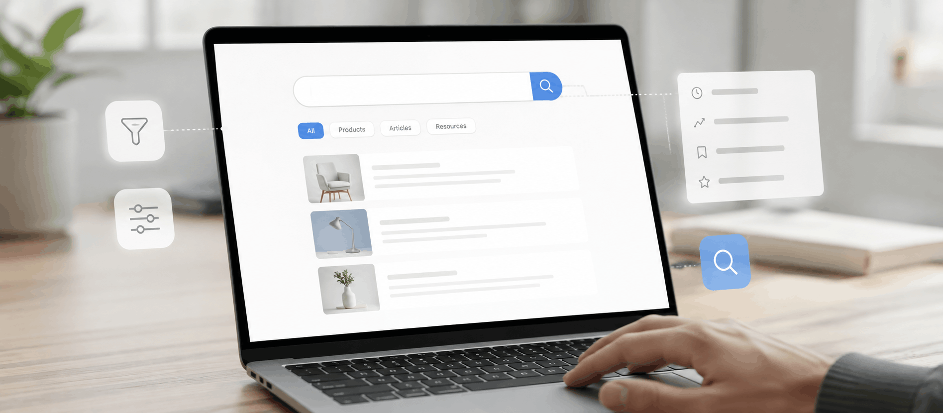
For stores with more than a handful of products, search isn’t optional — it’s core infrastructure. Search needs to tolerate typos, understand synonyms, and surface genuinely relevant results rather than just exact keyword matches. Filters for price range, size, category, or rating let users narrow down large catalos quickly, and sorting options help users organize results the way they think, not the way the database is structured. Weak search is one of the fastest ways to lose an otherwise interested buyer.
4. Mobile E-Commerce UX
A large share of e-commerce traffic now happens on phones, which makes Mobile App UX Design non-negotiable. This means responsive layouts that adapt properly rather than just shrink, thumb-friendly tap targets, readable font sizes without zooming, simplified mobile navigation often built around a clear hamburger menu, and a mobile checkout that doesn’t require excessive scrolling or zooming to complete a form.
5. Frictionless Shopping Cart
The cart should make it easy to review, adjust, and trust the order before moving to checkout. That means editable quantities without a page reload, transparent pricing that includes taxes and estimated shipping rather than hiding them until later, and a clear, single next step instead of a page cluttered with upsells and distractions.
6. Better Checkout UX
E-commerce checkout UX deserves special attention because it’s the final gate before revenue. Guest checkout removes a major barrier for first-time buyers. Fewer, better-organized form fields reduce cognitive load. Multiple payment options, including cards, wallets, and buy-now-pay-later where relevant, accommodate different preferences. Clear error handling that shows exactly what’s wrong and how to fix it prevents frustration, while progress indicators let users know how many steps remain. Visible trust elements, such as security badges and a clear return policy, reduce anxiety at the exact moment it matters most.
Research from the Baymard Institute on checkout usability consistently identifies these same friction points across large-scale studies of real e-commerce sites.
7. Clear Calls to Action
CTAs need a visual hierarchy — the primary action, like “Add to Cart” or “Buy Now,” should be the most visually dominant element on the page, with secondary actions clearly subordinate. Wording should be specific and action-oriented rather than vague. Consistency matters too: if “Add to Cart” looks different on every page, users have to relearn the interface each time.
8. Trust and Credibility
Online shoppers can’t physically inspect a product, so trust signals do the work that a physical store would otherwise do. Genuine reviews and ratings, clear return and refund policies, visible security indicators at checkout, accurate shipping timelines, and easy-to-find contact information all reduce the perceived risk of buying from an unfamiliar brand.
9. Website Speed and Performance
Slow-loading pages create friction before a user even sees the content. Performance affects not just actual load time but perceived speed — things like showing content progressively, using optimized images, and avoiding layout shifts as a page loads. A fast, stable experience signals reliability, which subtly reinforces trust in the brand itself. Google’s Web Vitals framework is a useful reference point for the specific performance metrics that tend to correlate with a smoother shopping experience.
10. Accessibility and Inclusive UX
Accessible design, including proper color contrast, keyboard navigation, screen-reader-friendly markup, and descriptive alt text, isn’t a niche concern. It expands the pool of customers who can actually use the store, and accessible patterns like clear labels, larger tap targets, and logical page structure tend to improve usability for everyone, not just users with disabilities. It’s also increasingly tied to legal compliance in many regions, making it a business consideration as much as a UX one.
Common E-Commerce UX Mistakes That Hurt Conversion Rates
Complicated navigation forces users to think too hard about where to look, and most will leave rather than dig for it. Poor product photography leaves shoppers uncertain about what they’re actually buying, which increases both hesitation and post-purchase returns. Weak product descriptions that are vague, generic, or missing key details like dimensions and materials push undecided buyers to abandon rather than guess.
Hidden shipping costs, revealed only at the final checkout step, are one of the most common and most damaging trust-breakers in e-commerce. Forced account creation adds friction for first-time buyers who just want to complete a purchase without commitment, and long checkout forms with unnecessary fields increase the mental effort required to finish — every extra field is a chance to lose someone.
Confusing CTAs, whether from unclear wording, poor visual contrast, or too many competing buttons, make it harder for users to know what to do next. Poor mobile experience alienates a huge share of potential buyers who are browsing and buying from their phones, and weak site search sends users into irrelevant results, which often ends the session entirely.
Difficult-to-find returns information creates hesitation before purchase, since shoppers want to know the exit option exists before they commit. A lack of trust signals leaves first-time visitors with no reason to believe the store is legitimate or reliable, while intrusive pop-ups, especially ones that block content immediately on arrival, frustrate users before they’ve even had a chance to evaluate the store. Finally, poor error messages that are vague or missing when a form fails leave users stuck without a clear way to fix the problem, often ending in abandonment.
Each of these mistakes shares a common thread: they add cognitive or emotional effort at a moment when the user is deciding whether to continue or leave.
How to Improve E-Commerce UX and Increase Conversions
Improving UX starts with understanding user behavior — learning how real visitors actually use the site, not how you assume they do. From there, the next step is identifying friction points: the moments where users hesitate, backtrack, or drop off entirely. Reviewing analytics helps surface this at scale, since metrics like drop-off rates, exit pages, and funnel completion reveal where the biggest losses are happening.
Beyond the numbers, conducting UX research means talking to actual or potential customers about what confuses them or holds them back, while running usability testing takes it a step further by watching real users attempt real tasks, such as finding a product or completing checkout, and noting exactly where they struggle. Heatmaps and session recordings can supplement this by revealing where users click, scroll, and hesitate in ways that don’t always show up in standard analytics.
Once the friction points are clear, the work shifts to creating UX improvements based on what the research actually showed rather than assumptions, then testing those changes through A/B testing or, at minimum, a structured before-and-after comparison, to validate whether they actually help. Measuring results afterward confirms the impact using the same behavior and conversion metrics tracked earlier. None of this is a one-time project — UX optimization is an ongoing discipline, because customer expectations and behavior shift over time, and the store needs to shift with them. The Nielsen Norman Group offers a solid grounding in the usability principles behind this kind of iterative testing.
This is the kind of structured, research-backed process that firms like AdvaitUX typically apply when working with e-commerce clients — pairing UX research and usability testing with design decisions grounded in actual user behavior rather than guesswork.
E-Commerce UX Metrics to Track
Conversion rate is the core measure of how well the site turns visitors into buyers, while the add-to-cart rate shows how well product pages are doing at generating purchase intent. Cart abandonment rate often points to pricing surprises, trust issues, or a confusing cart experience when it runs high, and checkout abandonment rate — separate from cart abandonment — isolates problems specifically within the checkout flow itself.
Bounce and engagement metrics help identify pages that fail to hold attention or answer the user’s initial question, while average order value can reveal whether product page UX, such as cross-sells or bundling, is influencing purchase size. Product page engagement, measured through time on page, scroll depth, and image interaction, shows whether the page is providing enough information to support a decision.
Search usage paired with a low result-click rate often signals weak or irrelevant search results, and return customer rate is a strong indicator of whether the overall experience, not just the product, is bringing people back. Each of these metrics tells a slightly different part of the UX story, which is why they’re most useful when reviewed together rather than in isolation.
E-Commerce UX: Before and After Example
Consider a hypothetical mid-sized apparel store. Its checkout originally required account creation, had eight form fields spread across three pages, and revealed shipping costs only on the final confirmation screen. Analytics showed a large share of users starting checkout but never completing it.
After a UX review, the team introduced guest checkout, consolidated the form into a single page with only essential fields, and displayed estimated shipping costs directly in the cart, before checkout even began. They also added a visible progress indicator so users knew exactly how many steps remained.
This is a hypothetical example, not a documented case study, but it illustrates a realistic pattern: when friction is removed at the exact points where users were previously hesitating or leaving, checkout completion tends to improve. The specific percentage improvement will vary by store, audience, and starting point, which is exactly why testing and measurement matter more than assumptions.
E-Commerce UX Best Practices Checklist
Use this as a quick self-audit for your own store. Check whether navigation is intuitive and organized around how customers think, rather than internal categories, and whether product pages include clear images, honest descriptions, and visible reviews. Confirm that site search returns relevant results even with typos, and that the mobile experience is fully responsive and easy to use one-handed.
Look at whether cart pricing is transparent, including shipping, before checkout begins, and whether checkout offers a guest option while avoiding unnecessary form fields. Make sure CTAs are visually distinct, consistent, and clearly worded, and that trust signals like reviews, policies, and security badges are visible where decisions actually happen. Finally, check that the site loads quickly and feels stable while loading, and that it’s accessible to users with visual, motor, or cognitive impairments.
FAQs
What is e-commerce UX design?
It’s the practice of designing how customers navigate, evaluate, and purchase products on an online store, covering everything from navigation and product pages to checkout and mobile usability.
How does UX design improve e-commerce conversion rates?
By removing friction at each decision point in the shopping journey, UX design makes it easier for visitors to find products, trust the store, and complete a purchase without hesitation or confusion.
What are the most important elements of e-commerce UX?
Navigation, product page design, search and filtering, mobile experience, cart usability, and checkout flow tend to have the most direct impact on conversions.
How can I improve my e-commerce website UX?
Start by reviewing analytics and user behavior to find where visitors drop off, then run usability testing to understand why, and make targeted improvements based on those findings rather than guesswork.
What UX mistakes reduce e-commerce conversions?
Common culprits include hidden shipping costs, forced account creation, long checkout forms, weak site search, and a poor mobile experience, each of which adds unnecessary friction at critical moments.
Conclusion
A well-designed e-commerce store isn’t defined by how it looks on a homepage — it’s defined by how easily a stranger can find a product, understand it, trust it, and buy it without friction getting in the way. Every element covered here, from navigation to checkout to accessibility, ultimately serves that same goal: reducing the distance between interest and purchase. Improving e-commerce UX design is rarely about one big redesign. It’s a continuous process of watching how real users behave, identifying where they struggle, and making deliberate, tested changes that remove friction over time. Stores that treat UX optimization as an ongoing discipline rather than a one-time project tend to see the compounding benefit in both conversion rate and customer loyalty. For teams that want an outside, research-driven perspective on where their store is losing customers, working with a dedicated UI/UX design AdvaitUX can help turn these principles into a structured, measurable improvement plan — see AdvaitUX’s checkout UX case studies for examples of this in practice.