Key Takeaways
- Marketplace UX has to serve two interdependent user groups — buyers and sellers — not just one primary user.
- Trust is the core product being sold in a marketplace; UX carries most of the weight of establishing it.
- Search quality is often the single highest-leverage investment for marketplaces with large catalogs.
- Onboarding friction, especially for sellers, quietly suppresses supply and listing quality over time.
- Hidden fees and unclear policies damage trust more than almost any other UX mistake.
- Guest checkout and minimal required fields consistently reduce cart abandonment.
- Mobile UX is essential, not optional, given how much marketplace browsing and buying happens on mobile devices.
- UX metrics should be tracked continuously and at each funnel stage, not just as high-level aggregates.
- Accessibility broadens the addressable market on both the buyer and seller side while reducing legal risk.
- Sustainable marketplace growth depends on the same UX discipline applied consistently to both sides of the platform, not periodic redesigns.
Nobody chooses a marketplace because it has the most listings. They choose the one where they can find what they need, trust the person selling it, and check out without wondering if they just made a mistake. Amazon didn’t win by having more products than everyone else — plenty of competitors had comparable catalogs. It won by making the entire process, from search to delivery, feel almost frictionless.
That’s the part of marketplace strategy that’s easiest to underfund and hardest to recover from once it’s gone wrong. A marketplace is really two products stitched together — one for buyers, one for sellers — and both sides need to trust the platform enough to keep coming back. Get the UX wrong on either side, and no amount of inventory or marketing spend fixes it. Sellers leave for a platform that’s easier to manage. Buyers leave for one that’s easier to trust.
This guide is written for the people actually building these platforms — founders, product managers, and designers working on B2B, B2C, SaaS-enabled, service, and multi-vendor marketplaces. It covers what separates marketplaces that scale from the ones that plateau, grounded in the specific UX challenges that make marketplaces harder to design well than a typical single-vendor product.
What Is Marketplace UX Design?
Marketplace UX design is the practice of designing a platform experience that serves two distinct user groups — buyers and sellers — at the same time, without either side feeling like an afterthought to the other. It covers everything from search and discovery to listing creation, transactions, communication, and dispute resolution.
Definition. Where most digital products design for a single primary user, marketplaces have to design for two interdependent ones. A buyer’s experience depends heavily on how well sellers can list and manage their offerings, and a seller’s success depends on how easily buyers can find and trust them.
Importance. A marketplace only works if both sides show up consistently. Poor UX on the seller side reduces supply and listing quality; poor UX on the buyer side reduces demand and trust. Either failure mode can quietly stall growth even when the underlying business model is sound.
Marketplace-specific UX challenges. Marketplaces deal with variable content quality (seller-generated listings instead of a controlled catalog), trust between strangers transacting through a third party, and often more complex checkout logic than single-vendor eCommerce, especially with multiple sellers in one order.
Buyer journey. Buyers move through discovery, evaluation, trust-building, transaction, and post-purchase support — and any friction at an early stage compounds through the rest of the journey.
Seller journey. Sellers need a low-friction path to list products or services, manage orders, communicate with buyers, and get paid reliably. A clunky seller dashboard doesn’t just frustrate sellers — it directly degrades the buyer experience through incomplete or poorly maintained listings.
Trust and usability. Because marketplaces connect strangers, trust has to be actively designed into the experience — through reviews, verification, transparent policies, and consistent interface quality — rather than assumed the way it might be on a single-brand storefront.
Why UX Determines Marketplace Success
User trust. Every marketplace transaction asks a stranger to trust another stranger, mediated by the platform. UX carries much of the weight of establishing that trust, since most users will never speak to a human representative before completing a purchase.
Higher conversions. Friction anywhere in the buyer Journey Map – UX UI Mastery— confusing search, unclear pricing, a clunky checkout — directly suppresses conversion. Marketplaces with cleaner, faster paths from discovery to purchase consistently outperform cluttered competitors, even with comparable inventory.
Better retention. Buyers return to marketplaces that make repeat purchases effortless — saved preferences, order history, fast reordering. Sellers stay on platforms where managing listings and payments doesn’t feel like a part-time job.
Reduced abandonment. Cart and listing abandonment often trace back to specific, fixable UX problems: unexpected fees at checkout, unclear shipping costs, or an overly long seller onboarding flow that loses people before their first listing goes live.
Increased customer satisfaction. Clear expectations, transparent policies, and predictable interactions reduce disputes and support volume, which matters enormously at marketplace scale where support costs multiply with every transaction.
Marketplace growth. Growth in a marketplace is inherently two-sided — more sellers attract more buyers, and more buyers attract more sellers. UX quality on both sides accelerates or stalls that flywheel more than almost any other factor within the platform’s control.
Understanding Marketplace Users
Buyers. Looking for relevant results quickly, clear pricing, and enough trust signals to feel comfortable purchasing from someone they’ve never interacted with before. Speed and confidence matter more to this group than exhaustive choice.
Sellers. Need an efficient way to list, manage, and sell products or services, along with visibility into performance and predictable payouts. A seller who struggles with the dashboard will list less, update less often, and eventually look elsewhere.
Vendors. In B2B or wholesale contexts, vendors often manage larger catalogs and more complex logistics than individual sellers, and need bulk tools — batch uploads, inventory sync, order management at scale — that a simple single-listing flow can’t support.
Administrators. Internal teams moderating content, resolving disputes, and monitoring platform health need efficient tools of their own. Weak admin UX often gets deprioritized, but it directly affects how quickly problems get resolved for both buyers and sellers.
Returning customers. Expect the platform to remember them — saved addresses, payment methods, order history, and personalized recommendations based on past behavior. Making a returning buyer start from scratch each time is a quiet but real retention cost.
New visitors. Arrive with the least context and the most skepticism. They need a fast, low-commitment way to evaluate whether the marketplace is legitimate and relevant before they’ll invest time creating an account or entering payment details.
Best Practices for Marketplace UX Design
Simple Navigation
Marketplace catalogs can grow into thousands of categories. Navigation needs a clear, shallow hierarchy that lets users reach relevant results in two or three clicks, rather than a deeply nested structure that buries products under layers of subcategories.
Powerful Search
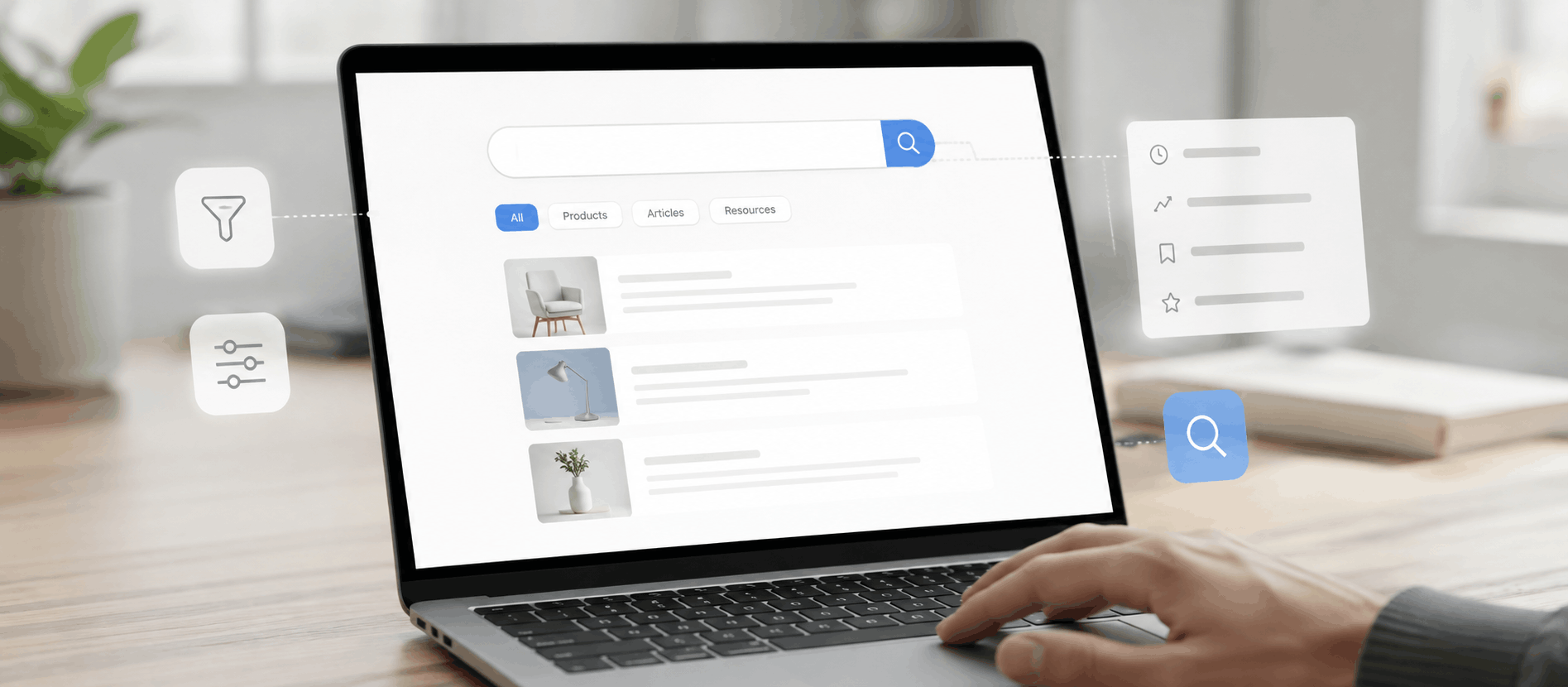
Search is often the primary way users navigate a marketplace, especially as inventory scales. It needs to tolerate typos, understand synonyms, and rank results by genuine relevance rather than simply matching keywords in a listing title.
Smart Filtering
Filters should reflect how users actually think about narrowing results — price range, location, rating, availability — and update dynamically without forcing a full page reload, which keeps the exploration process feeling fast and responsive.
Clear Product Pages
Listings need consistent structure: clear pricing, availability, seller information, and specifications presented predictably across the platform, even when individual sellers control the content within that structure.
Easy Checkout
Every additional step in checkout costs conversions. Marketplaces should minimize required fields, support guest checkout where possible, and make total costs — including any fees — visible before the final confirmation step, not after.
Mobile-First UX
A large share of marketplace browsing, and increasingly purchasing, happens on mobile. Designing core flows for smaller screens first tends to produce cleaner, faster experiences than adapting a desktop-first design after the fact.
Personalized Recommendations
Surfacing relevant listings based on browsing history, past purchases, or stated preferences increases both engagement and conversion, though personalization needs to stay genuinely helpful rather than feeling like manipulation.
Fast Performance
Marketplaces often carry heavy product imagery and complex filtering logic that can slow pages down. Performance directly affects both conversion and search ranking, making it a UX priority rather than a purely technical concern.
Accessibility
Marketplaces serve broad, diverse user bases, and accessible design — proper contrast, keyboard navigation, screen reader support — expands the addressable market while reducing legal risk.
User Feedback
Built-in mechanisms for reviews, ratings, and direct feedback don’t just build trust for future buyers — they give the platform a continuous signal for where the experience is breaking down for real users.
Designing Trust Into a Marketplace
Trust is the actual product being sold in most marketplaces — the ability to transact confidently with a stranger. UX carries much of the burden of establishing it.
Reviews. Detailed, specific reviews give buyers evidence beyond the seller’s own claims. Platforms that make reviews easy to leave and genuinely visible — not buried or easily gamed — build more durable trust over time.
Ratings. Simple aggregate ratings give buyers a fast way to filter quality before investing time reading detailed reviews, functioning as an efficient first pass in the trust-evaluation process.
Verified sellers. Verification badges signal that the platform has done some baseline diligence, reducing the perceived risk of transacting with an unfamiliar seller, particularly for higher-value purchases.
Secure payments. Visible security indicators around payment processing reduce hesitation at the exact moment users are asked to share financial information, especially for buyers new to the platform.
Return policies. Clear, easy-to-find return and refund policies reduce purchase anxiety significantly. Buyers are far more willing to take a chance on an unfamiliar seller when they know what happens if something goes wrong.
Social proof. Purchase counts, “trending” indicators, and visible activity from other users provide a subtle but effective form of trust-building, especially for buyers who are naturally more cautious.
Transparency. Clear pricing with no hidden fees, honest availability information, and straightforward seller policies consistently outperform tactics designed to obscure costs until late in the process.
Trust badges. Security certifications, buyer protection guarantees, and platform-level assurances — placed near key decision points, not just on a generic trust page — reduce hesitation exactly when it matters most.
Trust directly impacts conversions because uncertainty is the single biggest barrier to a stranger completing a transaction with another stranger. Every trust signal removed is friction added.
Marketplace Onboarding Best Practices
Buyer onboarding. Should be minimal — ideally allowing browsing and even purchasing before requiring full account creation. Every unnecessary step before a buyer’s first purchase is a chance to lose them.
Seller onboarding. Needs more structure than buyer onboarding, since sellers are making a bigger commitment, but should still be broken into manageable stages rather than one long form covering verification, payment setup, and listing creation at once.
Vendor verification. Identity and business verification steps are often necessary for trust and compliance, but should be clearly explained upfront — what’s required, why, and how long it typically takes — to reduce drop-off from sellers unsure what they’ve signed up for.
Progress indicators. Multi-step seller onboarding benefits significantly from visible progress, giving sellers a reason to complete setup rather than abandoning partway through an open-ended process.
Account creation. Supporting social login and minimizing required fields reduces friction at signup for both buyers and sellers, without necessarily compromising the additional verification that higher-trust actions may still require.
First purchase experience. The first transaction shapes whether a buyer trusts the platform enough to return. Clear order confirmation, realistic delivery expectations, and easy access to support during this first experience matter disproportionately.
Search and Discovery UX
Search bar design. Search should be prominent and forgiving — tolerant of typos, partial matches, and natural-language queries, since users rarely search using exact listing titles.
Auto-suggestions. Predictive suggestions as users type reduce effort and guide people toward results that actually exist in the catalog, preventing frustrating zero-result searches for close variations of available terms.
Filters. Filters need to reflect genuine decision criteria — price, location, availability, rating — and should update results dynamically, letting users refine without losing their place in the results.
Categories. Clear, logically organized categories support users who prefer browsing over searching, particularly for discovery-driven marketplaces where buyers don’t always know exactly what they’re looking for yet.
Sorting. Options like relevance, price, and rating give users control over how results are prioritized, which matters especially in marketplaces with large result sets where the “best” match varies by individual priority.
Empty states. A well-designed empty state — for an empty cart, a new seller’s dashboard, or a search with no matches — should guide users toward a next action rather than leaving them at a dead end.
Zero-result experiences. Search results with zero matches should suggest alternatives, related categories, or corrected spelling rather than simply displaying “no results found,” which is one of the most common points where users abandon a search entirely.
Product Listing UX Best Practices
Product cards. Consistent card layouts — image, title, price, key details — help users scan large result sets quickly, even when the underlying listings come from many different sellers with varying content quality.
Images. High-quality, consistent image standards across listings improve both trust and conversion. Marketplaces that enforce minimum image guidelines tend to see stronger buyer confidence than those that allow inconsistent, low-quality photos.
Pricing. Clear, upfront pricing — including any fees that will apply — prevents the frustration of discovering additional costs late in the process, which is one of the fastest ways to lose a buyer’s trust.
Availability. Real-time stock or availability status prevents buyers from investing time in a purchase flow only to discover an item is unavailable at the final step.
Shipping. Shipping costs and estimated delivery times should be visible early, ideally on the listing itself, rather than surfacing only during checkout when abandonment is more costly.
CTAs. Primary actions — “Buy Now,” “Add to Cart,” “Contact Seller” — should be clear and consistently placed across listings, so users don’t need to relearn the interface on every new page.
Product comparison. For categories where buyers naturally compare multiple options, built-in comparison tools reduce the need to open multiple tabs and can meaningfully shorten the decision-making process.
Marketplace Checkout UX
Guest checkout. Requiring account creation before purchase is one of the most common, avoidable sources of cart abandonment. Supporting guest checkout, with the option to create an account afterward, consistently improves conversion.
Multi-vendor checkout. When a single order includes items from multiple sellers, the checkout flow needs to handle separate shipping, pricing, and fulfillment clearly, without confusing the buyer with what looks like multiple, disconnected transactions.
Payment methods. Supporting multiple payment options — cards, digital wallets, and region-specific methods where relevant — reduces friction for a broader range of buyers, particularly in international marketplaces.
Shipping. Shipping costs, delivery windows, and options should be confirmed clearly before the final purchase step, not revealed as a surprise during checkout.
Order tracking. Clear, accessible order status after purchase reduces “where is my order” support inquiries and reassures buyers that the transaction is progressing as expected.
Confirmation pages. A clear confirmation summarizing what was purchased, from which seller, and what happens next reduces post-purchase anxiety and sets accurate expectations for delivery or service delivery.
Mobile Marketplace UX
Responsive design. Marketplace layouts need to adapt fully to mobile screens, particularly for dense content like filtered search results and multi-vendor carts, rather than simply shrinking a desktop layout.
Touch targets. Buttons, filters, and interactive elements need adequate size and spacing for accurate tapping, especially in dense listing grids common on mobile marketplace apps.
Mobile navigation. Category browsing and search need to remain fast and accessible within a mobile-appropriate navigation pattern, without hiding key actions behind extra taps.
Mobile search. Search should remain equally powerful on mobile, with support for voice input increasingly expected, given how often Mobile Design Guidelines search happens in hands-busy or on-the-go contexts.
Performance optimization. Mobile users are more likely to be on inconsistent connections. Lightweight pages and optimized images prevent abandoned sessions, particularly during high-intent moments like checkout.
Common Marketplace UX Mistakes
Complex onboarding. Lengthy signup processes, especially for sellers, lose people before they ever list a product. The fix is breaking onboarding into shorter, clearly explained stages.
Poor navigation. Deeply nested categories or inconsistent structure frustrate users trying to browse. Flattening hierarchy and organizing around how users actually think about the catalog resolves most of this.
Hidden fees. Fees revealed only at final checkout generate short-term frustration and long-term distrust. Surfacing all costs early, even on the listing page, builds more durable buyer confidence.
Slow loading. Marketplaces with heavy imagery and complex filtering are particularly prone to performance issues. Regular audits of page weight and load time prevent this from quietly suppressing conversions.
Too many filters. An overwhelming number of filter options can paralyze rather than help. Prioritizing the filters that genuinely drive decisions, and hiding the rest behind an “advanced” option, keeps the interface usable.
Weak search. Search that fails to handle typos or synonyms pushes users toward manual browsing or, more often, straight to a competitor. Investing in search quality is one of the highest-leverage UX improvements available to most marketplaces.
Inconsistent UI. Because listings often come from many different sellers, marketplaces need strong design systems to keep the overall experience consistent, even when individual listing content varies widely.
Poor accessibility. Marketplaces serving broad, diverse audiences can’t treat accessibility as optional. Beyond legal risk, it directly limits how many potential buyers and sellers the platform can actually serve.
Marketplace UX Metrics to Track
Conversion rate. The percentage of visitors who complete a purchase remains the clearest single indicator of overall UX health, though it should be tracked at each funnel stage, not just as one aggregate number.
Bounce rate. High bounce rates on category or search pages often signal a mismatch between what brought users there and what they found, pointing to specific UX problems worth investigating.
Cart abandonment. Tracking where in the checkout flow users drop off reveals exactly which step is causing friction, making it far more actionable than the abandonment rate alone.
Search success rate. The percentage of searches that lead to a click or purchase indicates how well search is actually serving user intent, and low rates often point directly to search relevance problems.
Session duration. While not inherently good or bad, unusually short sessions on key pages often indicate confusion or a mismatch between expectations and content.
Retention. The rate at which buyers and sellers return over time is one of the strongest indicators that the core experience is working well enough to build habitual use.
Customer satisfaction. Direct feedback through surveys or post-transaction ratings gives qualitative insight that quantitative metrics alone can miss, particularly around trust and perceived fairness.
Task completion rate. Measuring whether users successfully complete key tasks — listing an item, completing a purchase, resolving a dispute — highlights specific friction points that broader metrics can obscure.
Future Trends in Marketplace UX
AI personalization. Marketplaces are increasingly tailoring search results, recommendations, and even pricing based on individual user behavior, though the strongest implementations stay subtle rather than overtly algorithmic.
Voice search. As voice interfaces mature, marketplace search is beginning to support natural spoken queries, particularly for mobile and hands-busy contexts.
Visual search. Some marketplaces now let buyers search using an uploaded image rather than text, particularly useful in categories like fashion and home goods where descriptions struggle to capture visual details.
Predictive recommendations. Beyond simple “customers also bought” suggestions, some platforms are beginning to anticipate needs based on timing and past behavior — reordering essentials, seasonal suggestions, and similar patterns.
Conversational commerce. Chat-based interfaces are increasingly used for browsing, support, and even transactions, particularly in service marketplaces where buyers benefit from a more guided, conversational flow.
AR shopping. Augmented reality features — visualizing furniture in a room, trying on products virtually — are growing in specific categories where the gap between digital and physical evaluation matters most.
Hyper-personalization. As platforms gather more behavioral data, homepages and search results are increasingly tailored to individual users rather than showing the same generic experience to everyone.
Accessibility improvements. Growing regulatory attention and broader awareness are pushing accessibility from an afterthought toward a standard expectation across marketplace platforms.
How Great Marketplace UX Creates Business Growth
The connection between UX and marketplace growth isn’t abstract — it shows up directly in the metrics that determine whether a marketplace scales or stalls. Higher conversions come from removing friction in discovery and checkout. More repeat customers come from a trustworthy, low-effort experience worth returning to. Better seller satisfaction comes from tools that make managing a storefront feel manageable rather than burdensome. And greater marketplace trust — the hardest thing to build and the easiest to lose — comes from consistent, transparent design across every touchpoint where a stranger has to decide whether to trust another stranger, mediated by the platform.
This is the kind of compounding effect that experienced UX design partners, including agencies like AdvaitUX, are often brought in to help marketplaces achieve — not through a single redesign, but through the accumulated discipline of removing friction, building trust systematically, and designing for both sides of the transaction with equal care.
Real-World UX Patterns Worth Studying
Several well-known marketplaces illustrate specific UX principles worth studying, independent of any single company’s overall strategy.
Amazon built much of its dominance around search relevance and checkout speed rather than catalog size alone — a reminder that discovery and transaction friction often matter more to conversion than raw inventory.
Airbnb invested heavily in trust design early on — detailed host profiles, reviews, and verification — recognizing that its core UX challenge was convincing strangers to stay in each other’s homes, a trust problem before it was a booking problem.
Etsy organized its UX around discovery and storytelling, given that buyers often browse without a specific product in mind, which shaped a more exploratory search and recommendation experience than a typical transactional marketplace.
eBay pioneered many of the trust mechanisms — buyer and seller ratings, dispute resolution processes — that later became standard across the marketplace industry, illustrating how foundational trust infrastructure can differentiate a platform over the long term.
Upwork and Fiverr, as service marketplaces, both had to solve for a fundamentally different UX challenge than product marketplaces: helping buyers evaluate intangible expertise, which pushed both platforms toward detailed profiles, portfolios, and structured reviews as core trust mechanisms.
The pattern across these platforms isn’t a shared visual style — it’s a shared discipline: identifying the specific trust or friction problem unique to their category, and designing deliberately around it rather than applying generic eCommerce patterns.
Final Thoughts
Marketplace UX is fundamentally a trust design problem wearing the clothes of an interface design problem. Every navigation decision, every checkout step, every review system exists to answer one underlying question for the user: can I trust this platform, and the stranger on the other side of it, enough to proceed? Platforms that treat that question seriously — and design deliberately around it — tend to build the kind of durable, two-sided growth that’s difficult for competitors to replicate quickly.
Marketplace UX Audit Checklist
Navigation
- Is category hierarchy shallow enough to reach products in two or three clicks?
- Does navigation reflect how users think about the catalog, not internal organization?
Search
- Does search tolerate typos and understand synonyms?
- Are zero-result searches handled with helpful alternatives rather than a dead end?
Product Pages
- Is listing information structured consistently across different sellers?
- Are pricing, availability, and shipping clearly visible without extra clicks?
Trust
- Are reviews, ratings, and verification badges visible near key decision points?
- Are return policies and fees transparent before checkout begins?
Checkout
- Is guest checkout available?
- Are all costs, including fees, visible before the final confirmation step?
Mobile UX
- Does the layout adapt fully to mobile rather than shrinking desktop content?
- Are touch targets appropriately sized for accurate tapping?
Accessibility
- Does the site meet WCAG 2.1 AA contrast and keyboard-navigation standards?
- Have real accessibility users tested key flows, not just automated scanners?
Performance
- Do key pages load quickly on both desktop and mobile connections?
- Have image and asset weights been audited recently?
Content
- Is seller-generated content held to consistent quality standards?
- Are empty states designed to guide users toward a next action?
User Testing
- Has the platform run usability testing with both buyers and sellers recently?
- Are UX metrics reviewed regularly, not just at major redesign milestones?
Good Marketplace UX vs. Poor Marketplace UX
| Factor | Poor Marketplace UX | Good Marketplace UX |
|---|---|---|
| Navigation | Deep, confusing category structure | Shallow, intuitive hierarchy |
| Search | Exact-match only, weak relevance | Typo-tolerant, relevance-ranked results |
| Trust | Minimal reviews, unclear policies | Visible reviews, verification, transparent terms |
| Checkout | Required accounts, hidden fees | Guest checkout, upfront pricing |
| Conversion | High abandonment, unclear CTAs | Streamlined flow, clear next steps |
| Mobile Experience | Desktop layout shrunk to fit | Purpose-built mobile-first design |
Buyer Journey vs. Seller Journey
| Factor | Buyer Journey | Seller Journey |
|---|---|---|
| Goals | Find, evaluate, and purchase confidently | List, manage, and sell efficiently |
| Pain Points | Unclear pricing, weak search, low trust | Complex onboarding, poor dashboard tools |
| UX Expectations | Fast, low-friction discovery and checkout | Efficient listing management and clear payouts |
| Success Metrics | Conversion rate, repeat purchase rate | Listing completion rate, seller retention |
FAQs
1. What is Marketplace UX Design?
Marketplace UX design is the practice of designing digital experiences that serve both buyers and sellers on a platform, covering discovery, trust-building, transactions, and account management for both user groups simultaneously.
2. Why is UX important for online marketplaces?
UX directly affects conversion, trust, and retention on both sides of a marketplace. Poor UX on either the buyer or seller side can stall growth even when the underlying business model and inventory are strong.
3. How can marketplace UX increase conversions?
Conversions improve by reducing friction in search, checkout, and onboarding, surfacing trust signals early, and ensuring pricing and policies are transparent before a purchase decision is required.
4. What makes a marketplace user-friendly?
A user-friendly marketplace has intuitive navigation, powerful and forgiving search, clear and consistent product listings, transparent pricing, and a fast, low-friction checkout process.
5. What is the biggest UX mistake marketplaces make?
Hidden fees revealed late in checkout are among the most damaging UX mistakes, since they generate short-term frustration and long-term distrust that’s difficult to repair once a buyer has been surprised once.
Conclusion
Building a successful marketplace rarely comes down to one big feature or one clever growth hack. It comes down to consistently removing friction and building trust across hundreds of small decisions — how search handles a typo, how clearly a fee is disclosed, how quickly a new seller can get their first listing live. None of these look dramatic in isolation, but together they determine whether both sides of the marketplace keep showing up.
The founders and product teams who get this right tend to share one habit: they measure the experience constantly, on both the buyer and seller side, rather than assuming it’s working because the business is growing. UX debt in a marketplace compounds quietly, the same way trust does — and by the time it shows up clearly in the numbers, it’s usually already cost the platform sellers, buyers, or both.