Key Takeaways
- Search UX design covers the full journey from finding the search function to acting on results, not just the input field itself.
- Poor search can undermine an otherwise well-designed product, because it fails users at the exact moment they’ve expressed clear intent.
- Autocomplete, relevant results, and forgiving spelling handling all reduce the effort required to find what users are looking for.
- Filters and sorting turn large result sets into something genuinely usable, but only when they’re easy to apply and easy to clear.
- Zero-result pages should redirect users toward a solution rather than ending their journey with nothing.
- Mobile search needs its own design considerations, not a simple shrink of the desktop experience.
- Accessibility should be built into search from the start, covering keyboard navigation, screen readers, and clear error handling.
Search and navigation work best together, with search serving users who already know what they want and navigation supporting those who are still exploring. Measuring search performance regularly, through metrics like zero-result rate, abandonment, and task completion, is what turns search UX from a one-time redesign into an ongoing practice of improvement. Small details like clear placeholder text, visible clear controls, and consistent terminology often matter as much to the overall experience as the underlying search technology itself.
Search UX design is often treated as an afterthought — a text field bolted onto a homepage, wired up to a database query, and left alone. But search is rarely that simple in practice. It touches information architecture, content structure, interface design, error handling, even the tone of your microcopy. A search box that looks clean but returns irrelevant results, or that punishes a small typo with a blank page, does more damage to user experience than almost any other single element on a site.
What Is Search UX Design?
Search UX design is the practice of designing every step a user goes through when they search for something — not just the input field, but the entire journey around it. That journey usually includes finding the search function in the first place, typing or speaking a query, seeing suggestions appear, reviewing the results, refining or narrowing them, making sense of what’s in front of them, and finally taking action, whether that’s opening an article, adding a product to a cart, or navigating to a specific record inside a SaaS dashboard.
It’s easy to think of search as a technical feature — something search engines or backend indexing handle. And technology does matter. But UX search design is about the human side of that technology: how discoverable the search function is, how forgiving it is of imperfect input, how clearly it communicates results, and how easily a user can recover when their first attempt doesn’t work.
Treating search as an end-to-end experience, rather than a single input field, is the mindset shift that separates good search UX design from search functionality that merely exists.
Why Search UX Matters for Usability and User Experience
A well-designed search experience lets users find information faster, discover products or content they weren’t specifically looking for, and complete tasks with less effort. On large or complex sites, search often becomes the primary way people navigate, especially once traditional menus and categories become too deep or too numerous to browse comfortably.
Good search also reduces cognitive load. Instead of forcing users to guess which category or menu item might contain what they need, a well-designed search interface lets them describe what they want in their own words and trusts the system to interpret it. This is particularly valuable for users who are goal-driven rather than exploratory — someone looking for a specific product SKU, a particular document, or a setting buried three menus deep inside a SaaS application.
The inverse is just as true, and arguably more damaging. Poor search creates friction even in an otherwise well-designed product. A user can love your visual UX Design, your onboarding flow, and your content, but if they search for something reasonable and get irrelevant results, or nothing at all, that single failure can define their entire impression of the product. Search sits at a strange intersection in UX: it’s used precisely when a user already has intent and motivation, which means a broken search experience wastes exactly the moment when a user was most ready to convert, engage, or complete a task.
Key Elements of Good Search UX Design
Make Search Easy to Find
Search should be visible where users expect it, typically in the header, using a recognizable icon such as a magnifying glass, ideally paired with a visible input field rather than a small icon that only expands on click. Hidden or overly minimal search patterns can work on some content-light sites, but on any site where search is a primary navigation tool, such as e-commerce or documentation platforms, the search field should remain visible rather than tucked away behind an extra interaction. Nielsen Norman Group’s research on search visibility has long pointed out that search functions as a lifeline for users navigating complex sites, and that a simple, visible search box consistently outperforms a hidden or overly clever one. If your users rely on search often, make it a permanent fixture rather than something they need to hunt for.
Design a Clear Search Input
The input field itself deserves more thought than it usually gets. Placeholder text should hint at what can be searched, for example “Search products, brands, or categories” rather than a generic “Search,” which gives users no sense of what the field expects. A visible search button helps users who prefer clicking over pressing enter, and a clear or “x” control lets people quickly reset a query without manually deleting each character. On mobile, the input field needs enough padding to be comfortably tappable, and voice search can be a genuine usability improvement in contexts like e-commerce apps or navigation-heavy platforms, though it isn’t necessary everywhere.
Use Autocomplete and Search Suggestions
Autocomplete helps users reach relevant results without typing a full, precise query, and it can guide people toward terms that actually exist in your content or catalog rather than ones that return nothing. Search suggestions are especially useful on e-commerce sites, where they can surface trending products or fix minor spelling issues before the user even finishes typing.
That said, suggestions can become a liability if they’re mistimed, cover the input field awkwardly, or surface irrelevant terms. A useful rule of thumb is that autocomplete should reduce a user’s effort, not add another decision they have to evaluate. If suggestions regularly contain unhelpful or unrelated terms, they train users to ignore them, which defeats the purpose of building the feature at all.
Create Helpful Search Results
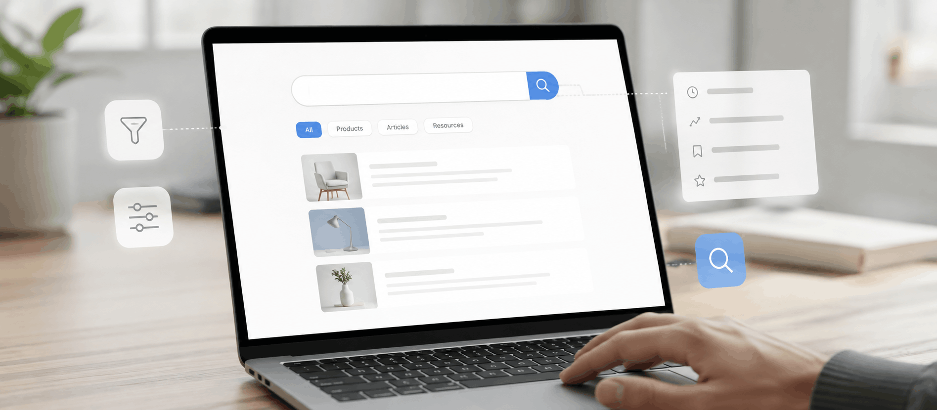
Once a user submits a query, the results page becomes the real test of your search UX. Relevance matters most, but so does clarity. Result titles should be easy to scan, and descriptions should give enough context for someone to judge, at a glance, whether a result is worth opening. Highlighting the matching terms within a result can help users quickly see why something appeared in their search, especially on content-heavy sites like documentation or knowledge bases.
Where appropriate, images add enormous value, particularly in e-commerce search, where a product photo often tells a user more in half a second than three lines of text could. Metadata such as price, category, publish date, or file type gives users additional context to judge relevance without opening each result individually. And every result should have an obvious next step, whether that’s a clear “Add to Cart” button, a link to read more, or a direct path into a specific SaaS record. Whether a results layout is actually working is rarely obvious from UX Design intuition alone, which is where structured usability testing earns its place in the process.
Design Useful Filters and Sorting
For any platform with a meaningful volume of content or products, filters and sorting options are what turn a long results list into something actually usable. E-commerce stores rely on filters for price range, brand, size, and availability. SaaS platforms often need filtering by owner, status, date, or project. Content libraries benefit from filtering by category, tag, or content type.
The key UX consideration is that filters need to be understandable at a glance, easy to discover without hunting through a sidebar, and simple to remove once applied. A user who applies three filters and then can’t figure out how to clear them, or even see which filters are currently active, will often abandon the search entirely rather than fight the interface.
Handle Zero-Result Searches Properly
A blank “No results found” message is one of the most common and most damaging failures in search UX design. It tells the user their search failed, but gives them nothing to do next, which effectively ends their journey right there. A stronger approach acknowledges the failed search, then offers a path forward: a suggestion for a related or corrected query, a spelling correction if the system suspects a typo, links to related categories, or a short list of popular results the user might still find useful.
The goal isn’t to trick the user into thinking their search succeeded. It’s to treat a zero-result page as an opportunity to keep them engaged rather than a dead end that pushes them to leave.
Support Misspellings and Search Variations
Real users rarely type perfectly. They misspell words, use abbreviations, search in singular when your content is indexed in plural, or describe something using a synonym rather than the exact term used in your product. A well-designed search experience accounts for this variation gracefully, correcting obvious typos, recognizing common synonyms, and matching singular and plural forms of the same word.
This doesn’t require deep technical knowledge of search engine architecture to design for. From a UX standpoint, the underlying principle is simple: the system should be more forgiving than the user is precise, because users searching for “sneaker” and “sneakers” almost always want the same thing.
Design for Mobile Search UX
Mobile Search UX Design differs from desktop in several practical ways. Screen space is limited, so the search field competes with navigation, branding, and content for room. Touch targets need to be large enough to tap comfortably, and the on-screen keyboard needs to behave predictably, ideally showing a “search” or “go” action button rather than a generic return key.
Suggestions and filters need to be redesigned for a smaller screen rather than simply shrunk down, often moving into modal overlays or bottom sheets rather than sidebars. Result scanning on mobile also tends to be faster and less forgiving, so titles, images, and key details need to be front-loaded rather than buried below the fold. A clear control to reset or modify the search is just as important on mobile as it is on desktop, arguably more so, since retyping a long query on a phone keyboard is far more tedious than on a physical one.
Keep Search Results Consistent
Consistency in layout, terminology, filtering behavior, and pagination style helps users build a mental model of how search works across your product. If one part of the site paginates results in pages of ten while another uses infinite scroll, or if filter terminology shifts between sections, users have to relearn the pattern each time, which adds friction that has nothing to do with the actual content they’re searching for.
Make Search Accessible
Accessible search design means the interface works for people navigating by keyboard alone, people using screen readers, and people with visual or motor impairments. That includes clear, programmatically associated labels for the search input, visible focus states so keyboard users can track where they are, sufficient color contrast on text and controls, touch targets large enough for users with limited dexterity, and error messages that clearly explain what went wrong rather than relying on color alone.
Autocomplete suggestions should also be accessible, announced properly to screen readers and navigable by keyboard rather than requiring a mouse. Aligning search interfaces with the Web Content Accessibility Guidelines (WCAG) published by the W3C is a reasonable baseline to design toward, though the specific techniques needed will depend on your platform and the assistive technologies your users rely on.
Search UX Best Practices by Product Type
Search UX isn’t one-size-fits-all. The right approach depends heavily on what users are searching for and what they intend to do once they find it.
In e-commerce, product search UX is largely about discovery and comparison. Users need to filter by price, brand, availability, and category, and results need enough visual and contextual information — images, pricing, ratings — to support quick decisions.
In SaaS products, search UX often deals with a different kind of complexity: users are searching across records, documents, dashboards, projects, team members, or settings, sometimes across multiple modules within the same application. Here, clarity about what type of content a result represents matters as much as relevance, since a “Q3 Report” could be a document, a dashboard, or a folder, and the user needs to know which before they click.
Content-rich websites, such as blogs, documentation sites, and knowledge bases, rely on search to help users navigate large volumes of articles, guides, and resources. Categories, tags, and content freshness all play into how relevant a result feels, and users often appreciate being shown related content even when their exact query doesn’t have a perfect match.
Mobile apps bring their own constraints, primarily limited screen space and keyboard interaction, which push toward simpler, faster search patterns designed for quick discovery rather than deep exploration.
Across all of these contexts, the underlying principle stays the same: search UX should be designed around the user’s task and the product’s context, not treated as a generic, interchangeable component.
Common Search UX Mistakes
Several recurring mistakes show up across otherwise well-designed products, and each one chips away at usability in a slightly different way.
Hidden search functionality forces users to hunt for a feature they expected to find immediately, which is especially damaging on content-heavy or product-heavy sites where search is a primary navigation method. Poor placeholder text leaves users guessing what they’re even allowed to search for. Irrelevant results erode trust in the search function itself, often permanently, since users who get burned once tend to avoid search on future visits. A missing autocomplete feature means users have to type full, exact queries with no assistance, increasing the odds of a failed search.
Weak filtering, or filters that are hard to find or hard to clear, turns a helpful tool into a source of frustration. No tolerance for spelling mistakes punishes ordinary human typing behavior. Unhelpful zero-result pages end the user’s journey rather than redirecting it. Result lists cluttered with too many loosely related items force users to do the filtering work the interface should be doing for them. Mobile search that wasn’t designed specifically for smaller screens creates friction disproportionate to the platform’s importance in overall traffic. Confusing terminology, no visible way to clear or modify a search, inaccessible controls, and overly complex interfaces round out the list of problems that, individually, might seem minor, but collectively define whether users trust your search function at all.
Each of these issues has a straightforward fix once identified, which is exactly why regular usability testing and search behavior analysis matter so much.
How to Improve Search UX
Improving search UX is rarely about a single redesign. It’s closer to an ongoing process, and most successful search improvements follow a similar path, often starting with a structured UX audit to establish where the current experience is falling short. Start by understanding actual user search behaviour rather than assuming it, then analyse existing search queries to see what people are actually typing, including the phrasing, terminology, and variations they use naturally.
From there, identify common search failures, whether that means queries returning zero results, queries with high abandonment, or patterns where users repeatedly reformulate the same search. Mapping the search-related user journey, from the moment someone opens the search field to the moment they either succeed or give up, tends to reveal friction points that aren’t obvious from looking at the interface alone.
Information architecture often needs attention alongside the search interface itself, since even a well-designed search box can’t compensate for poorly structured or inconsistently tagged content. Wireframes and prototypes let teams test new search flows before committing engineering resources, and usability testing, ideally with real or realistic queries, surfaces problems that internal assumptions tend to miss.
Once changes are live, analyzing search performance data and testing improvements against real usage closes the loop. Search UX isn’t something you fix once. User needs shift, catalogs and content libraries grow, and terminology evolves, so continuous optimization keeps search aligned with how people are actually using your product.
How to Measure Search UX Performance
Several metrics give teams a clear picture of how well search is actually performing. Search success rate shows how often users find what they’re looking for. Search abandonment reveals how often people give up mid-search, which often points to frustration with results or filtering. Search refinement rate, meaning how often users adjust or retype their query, can indicate that initial results weren’t relevant enough on the first attempt.
Zero-result rate is one of the most direct signals of a search gap, showing exactly which queries return nothing and where content or catalog gaps might exist. Click-through rate from search results indicates whether the results themselves look relevant and compelling enough to act on. Time to find information reflects overall search efficiency, while search usage and query frequency show how much users rely on search relative to other navigation methods.
User satisfaction, often gathered through direct feedback or usability testing, adds qualitative context that raw numbers can’t fully capture, and task completion ties search performance back to the broader goal: did the user, in the end, accomplish what they came to do. Rather than fixating on any single number, the most useful approach looks at these metrics together, since a low zero-result rate paired with high abandonment, for instance, tells a very different story than either metric alone.
Realistic Search UX Example
Consider a hypothetical mid-sized e-commerce website selling outdoor gear. A user searches for “waterproof jacket,” expecting to see relevant rain jackets near the top of the results. Instead, the results page mixes waterproof jackets with unrelated items like water bottles and rain boots, simply because those product descriptions happen to contain the word “water.” There’s no way to filter by size, price, or brand, and a slightly different query, such as “water proof jacket” with a space, returns nothing at all.
A UX-focused redesign would address each of these problems individually. Autocomplete could guide the user toward “waterproof jacket” or “rain jacket” as they type, reducing ambiguity before the search is even submitted. Search relevance could be tuned so that product category and title weight more heavily than incidental keyword matches buried in a description. Filters for size, brand, price, and color would let the user narrow a broad results list into something manageable. Basic spelling tolerance would ensure that “water proof” and “waterproof” return the same relevant results rather than treating them as entirely different queries.
None of these changes require inventing new technology. They’re UX decisions about relevance, forgiveness, and clarity, applied consistently across the search experience.
Search UX vs Website Navigation
Search and navigation solve different problems, even though they often get lumped together as “how users find things.” Navigation, through menus, categories, and breadcrumbs, works well when users are exploring, when they’re not entirely sure what they want, or when they benefit from seeing the full landscape of what’s available. Search works best when users already know, at least approximately, what they’re looking for, and simply want the fastest path to it.
Users tend to search when they have a specific term or product in mind, when a site is large enough that browsing feels inefficient, or when they’ve searched successfully on similar sites before and expect the same shortcut to work here. Navigation tends to serve better for users who are still discovering what a site or product offers, or who benefit from category structure to understand the scope of what’s available.
Strong digital products rarely rely on just one. Good navigation gives structure and context, while good search gives speed and precision, and the two should reinforce rather than compete with each other. A site with excellent navigation but broken search will frustrate goal-driven users, while a site with excellent search but confusing navigation will frustrate users who are still exploring.
Frequently Asked Questions
What is search UX design?
Search UX design is the practice of designing the complete search experience, including how users find the search function, enter a query, view suggestions, review results, refine their search, and take action, rather than focusing only on the appearance of the search input.
Why is search UX important?
Search UX matters because users typically search when they already have clear intent. A poor search experience wastes that intent, creating frustration and often causing users to abandon a task even when the rest of the product is well designed.
What makes a good search experience?
A good search experience is easy to find, forgiving of typos and phrasing variations, returns relevant and clearly presented results, offers useful filtering and sorting, and gives users a clear path forward even when their initial search doesn’t return exactly what they wanted.
What are the best practices for search UX?
Core best practices include making search visible and easy to access, providing helpful autocomplete, designing relevant and well-labeled results, supporting filters and sorting for larger content sets, handling zero-result searches gracefully, and ensuring the entire experience is accessible.
Conclusion
Search often gets treated as a small, self-contained feature — a box in the header wired up to a database — when in reality it’s one of the most consequential parts of the entire user experience. Every element covered here, from visibility and input design to relevance, filtering, zero-result handling, and accessibility, contributes to whether a user’s moment of clear intent turns into a completed task or a quiet exit.
The products that get search right tend to treat it as a discipline in its own right, not a checkbox. They study how people actually search, test their assumptions against real behaviour, and keep refining the experience as content, catalogs, and user needs evolve. That ongoing attention is what separates search functionality that technically works from search UX design that genuinely serves the people using it. Teams that invest the same care into search that they invest into visual design or onboarding tend to see it pay off in exactly the moments that matter most: when a user already knows what they want and is counting on the product to help them get there.
At AdvaitUX, this kind of thinking shapes how search experiences get evaluated and improved, drawing on UX research, usability testing, and information architecture work to understand not just how a search interface looks, but how well it actually performs for the people relying on it. That same process feeds into broader UI/UX design work, since search is rarely a problem that can be solved in isolation from the rest of the interface.