Key Takeaways
- Healthcare app UX design has to account for a wider range of technical comfort, emotional state, and accessibility needs than most consumer apps.
- Appointment booking, onboarding, and patient portals tend to be the highest-friction, highest-value areas to focus UX effort on.
- Accessibility, guided by standards like WCAG, is a core requirement in healthcare UX, not an optional enhancement.
- Clear error messages and visible feedback after actions reduce patient uncertainty at critical moments.
- Mobile UX deserves dedicated attention, since a large share of patients interact with healthcare apps primarily on their phones.
- UX supports patient trust, but it works alongside — not in place of — genuine privacy, security, and clinical practices.
- Improving healthcare app UX is an ongoing process built on research, testing, and iteration, not a single redesign effort.
A healthcare app can be visually polished and still fail the people who need it most. A patient trying to book an appointment gets stuck in a confusing multi-step form. Someone looking for their lab results can’t find where the app put them. A first-time user abandons registration halfway through because it asks for information that feels excessive at that stage. None of these are bugs — they’re UX problems, and in healthcare, UX problems carry more weight than they do almost anywhere else.
That’s what makes healthcare app UX design different from designing UX for a typical consumer product. Patients using these apps aren’t always calm, patient, or tech-savvy in the moment. They might be anxious, in discomfort, managing a chronic condition, or helping an elderly parent navigate a portal for the first time. The relationship between healthcare app UX design and patient experience isn’t a nice-to-have — it directly shapes whether someone can actually get what they came for.
This article walks through what healthcare app UX design really involves, why it matters, the specific practices that make the biggest difference, common mistakes worth avoiding, and a practical process for improving an existing product.
What Is Healthcare App UX Design?
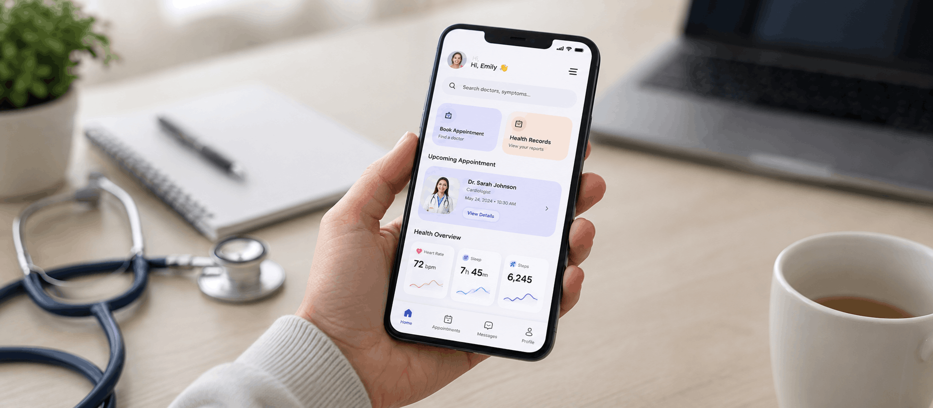
Healthcare app UX design is the practice of shaping how patients interact with digital health products — patient portals, appointment booking tools, telehealth platforms, medication trackers, and similar apps — so that the experience is clear, usable, and appropriate for the context patients are in.
It borrows from general UX principles, but healthcare user experience has its own constraints. Users span a much wider range of technical comfort than a typical consumer app audience, from teenagers to elderly patients managing multiple conditions. Emotional state matters more too — someone checking a test result or scheduling a follow-up visit isn’t in the same headspace as someone browsing a shopping app. And accessibility isn’t optional in healthcare; a portal that’s hard to use for someone with low vision or limited mobility is failing a meaningful share of the population it’s meant to serve.
Good healthcare app design accounts for all of this. It’s not just about clean visuals — it’s about designing an experience that works when the user is stressed, distracted, or unfamiliar with the interface.
Why UX Matters in Healthcare Apps
UX shapes nearly every meaningful interaction a patient has with a digital health Product Experiences.
It affects how easily someone finds information — whether that’s a provider’s office hours, a billing statement, or instructions after a visit. It affects appointment booking, where an overly complicated flow can mean a patient gives up and calls the front desk instead, defeating the purpose of the app entirely. It shapes patient onboarding, since a confusing registration process can push a new user away before they’ve experienced any value at all.
UX also determines how easily patients can access medication or health information, how smoothly they can communicate with their provider through secure messaging, and how comfortable telehealth interactions feel when technical friction gets in the way. Beyond individual tasks, UX quietly influences patient confidence and trust — a well-organized, predictable interface signals that the organization behind it is careful and competent, while a clunky one raises quiet doubts. Accessibility ties into all of this too, since an app that only works well for some patients isn’t really serving its full purpose.
None of this is about medical outcomes — it’s about whether the digital experience helps or hinders the patient at each step. That distinction matters, and it’s the lens this article stays within throughout.
Healthcare App UX Design Best Practices
1. Design Around Real Patient Needs
Patient-cantered App UX Design starts with actual research, not assumptions. That means talking to real patients, building personas that reflect meaningfully different needs — a chronic-condition patient managing ongoing care looks very different from someone booking a one-time visit — and mapping out patient journeys to understand where confusion or hesitation tends to show up. Skipping this step is one of the fastest ways to end up with an app that looks good in a design review but doesn’t hold up with real users.
2. Keep Navigation Simple
Healthcare apps often try to pack in a lot: appointments, messages, records, billing, prescriptions, and more. Clear information architecture keeps this from turning into clutter. Predictable healthcare app navigation, a search function that actually works, and consistent placement of core actions help patients build a mental model of the app quickly — which matters a lot when a patient only opens it a few times a year. This is a good example of a broader point in Dashboard UX Design Best Practices : the simplest structure that still covers everything a patient needs almost always outperforms a feature-complete but cluttered one.
3. Simplify Appointment Booking
This is one of the highest-friction flows in most healthcare apps, and one of the most valuable to get right. That means making it easy to discover available appointment types, select the right provider, see genuinely open time slots, and get a clear confirmation. Rescheduling and cancellation deserve just as much attention as initial booking — patients need to be able to adjust plans without navigating a maze to do it. Every unnecessary step here is a chance for a patient to give up and call instead.
4. Create Clear and Readable Interfaces
Typography, spacing, and visual hierarchy carry a lot of weight in healthcare apps because the content itself is often dense or technical. Clear heading structure, generous spacing, readable font sizes, sufficient contrast, and buttons and icons that are unambiguous all reduce the mental effort required to use the app. This matters especially for older patients or anyone using the app while distracted or unwell.
5. Make Healthcare Information Easy to Understand
Information in a healthcare app should be organized and presented clearly — logical grouping, plain language where possible, and a structure that lets patients scan for what they need rather than read everything top to bottom. This is a UX and content- App UX Design responsibility, not a medical one: the goal is clarity and accessibility of presentation, not interpreting or simplifying medical guidance itself.
6. Improve Patient Onboarding
Healthcare app onboarding often asks for a lot upfront — identity verification, insurance details, consent forms, medical history. Some of this is unavoidable, but UX can reduce the friction around it: breaking the process into manageable steps, explaining why information is being requested, showing progress, and avoiding asking for anything that isn’t actually needed at that stage. A registration flow that feels reasonable rather than invasive makes a real difference in completion rates.
7. Design for Accessibility
Accessibility in healthcare apps isn’t a nice extra — it’s core to whether the product actually serves its population. This includes keyboard accessibility where applicable, compatibility with screen readers, sufficient color contrast, readable text sizing, touch targets large enough for users with limited dexterity, clear and descriptive labels, helpful error messaging, and never relying on color alone to communicate status or urgency. The Web Content Accessibility Guidelines (WCAG) are the standard reference point here, and designing to at least WCAG 2.1 AA is a reasonable baseline for most medical app UX design work. Healthcare app accessibility also tends to improve the experience for every user, not just those with specific needs — larger touch targets and clearer labels help a rushed or distracted user just as much as they help someone with a permanent disability. The U.S. Department of Health and Human Services’ guidance on website accessibility is a useful supplementary reference for healthcare organizations operating in the U.S.
8. Build Trust Through UX
Trust in a healthcare app is built gradually, through visual consistency, transparent communication about what’s happening at each step, predictable interactions that don’t surprise the user, and clear privacy messaging around how information is handled. Professional, consistent design reinforces the sense that the organization behind the app is careful and reliable. It’s worth being clear-eyed here: good UX supports trust, but it doesn’t replace the actual security, privacy, and clinical practices that trust ultimately depends on.
9. Design Better Error States
Errors are inevitable, but how they’re handled matters enormously in a healthcare context. A good error message explains what went wrong in plain language, gives a reason when it’s genuinely helpful to the user, and — most importantly — tells the patient exactly what to do next. Technical jargon or vague messages like “something went wrong” leave patients stuck at exactly the moment they need clarity most.
10. Optimize Mobile Healthcare Experiences
A large share of patients interact with healthcare apps primarily on their phones, which makes mobile UX a first-class concern rather than an afterthought in any serious healthcare product design effort. This means thumb-friendly layouts, fully responsive design, readable content without zooming, appropriately sized touch targets, simplified navigation suited to a smaller screen, forms that are genuinely usable on mobile, solid performance, and consistent behavior across devices and operating systems. Weak healthcare app usability on mobile is one of the most common gaps between an app that tests well on a desktop prototype and one that actually holds up in daily use.
11. Design Effective Patient Portals
Patient portal UX needs to make it easy to find records, upcoming appointments, secure messages, and notifications without burying any of it under unnecessary complexity. The temptation with portals is to surface everything at once; the better approach is prioritizing what patients need most often and keeping less-frequent tasks accessible but out of the way.
12. Improve Telehealth UX
Telehealth UX design has its own set of considerations: making it simple to join a virtual appointment, clearly explaining what’s needed to prepare, handling camera and microphone permissions smoothly, giving clear feedback during connection issues, and providing a visible waiting state so patients aren’t left wondering if anything is happening. These are product-experience concerns, not clinical ones — the goal is removing technical friction so the actual visit can happen smoothly.
Common Healthcare App UX Mistakes
Complicated registration is one of the most common problems, often because the app asks for too much information too early, before the patient has any reason to trust the process. Too many steps in any flow — booking, onboarding, messaging — compounds this, since each additional step is another chance for the patient to abandon the task.
Confusing navigation, often the result of trying to fit too many features into an app without a clear hierarchy, leaves patients unsure where to find what they need. Small touch targets create real problems for patients with limited dexterity or those using the app on a small screen, and poor accessibility more broadly excludes a meaningful share of users who may have vision, hearing, or motor impairments.
Unclear error messages leave patients stuck without knowing how to move forward, which is especially frustrating in a healthcare context where the stakes feel higher. Overloaded dashboards that try to show everything at once overwhelm patients rather than helping them, and difficult appointment booking remains one of the most damaging issues since it’s often the single most important task in the app.
Excessive forms, particularly ones that ask for redundant information already on file, waste patient time and erode goodwill. Poor mobile responsiveness alienates the large share of patients using phones rather than desktops, and unclear notifications — vague or overly frequent — train patients to ignore alerts that might actually matter. Confusing terminology, whether clinical jargon or inconsistent labeling, adds cognitive load at exactly the wrong moment. And a lack of user feedback after actions, like submitting a form or completing a booking without any confirmation, leaves patients uncertain whether something actually worked.
Each of these mistakes shares a root cause: they ask more of the patient, cognitively or emotionally, than the moment calls for.
How to Improve Healthcare App UX
Improving healthcare app UX generally follows a structured process. It starts with user research to understand who’s actually using the app and what they need, followed by patient journey mapping to visualize the full experience across touchpoints, not just isolated screens. From there, information architecture organizes content and features in a way that matches how patients actually think about their care.
Wireframing and prototyping let teams test structure and flow before investing in full visual design, and usability testing — watching real patients attempt real tasks — reveals where confusion or friction actually occurs, often in places the design team didn’t anticipate. Measuring healthcare usability this way, rather than relying on internal opinion, is what separates a product that looks good in review from one that holds up with real patients. An accessibility evaluation, ideally benchmarked against WCAG standards, should happen alongside this rather than as an afterthought.
UI design then brings the tested structure to life visually, and close collaboration with development ensures the intended experience survives implementation without being compromised by technical shortcuts. Finally, post-launch UX measurement and iteration treats the app as a living product — reviewing real usage data and continuing to refine the experience rather than treating launch as the finish line.
This is the kind of end-to-end process that a firm like AdvaitUX typically applies with healthcare clients, combining UX research and usability testing with accessibility evaluation to make sure the finished product actually works for the patients using it.
Healthcare App UX Metrics to Track
Task completion rate shows whether patients can actually finish what they set out to do, whether that’s booking an appointment or updating their profile. Time on task can reveal whether a flow is more complex than it needs to be, particularly when it’s noticeably longer than expected for a simple action.
User error rate highlights where patients are making mistakes, often pointing to unclear labeling or confusing form design. Appointment booking completion and onboarding completion are especially important in healthcare apps since these are typically the highest-value flows, and a low completion rate on either usually signals a specific point of friction worth investigating.
Form abandonment pinpoints exactly where in a longer process patients are giving up, while feature adoption shows whether new capabilities are actually being used or quietly ignored. User satisfaction, gathered through surveys or in-app feedback, adds a qualitative layer that raw behavioral data can’t fully capture. And support requests related to usability — patients calling or emailing because they couldn’t figure something out in the app — are often an underused but very direct signal of where UX is falling short. The Nielsen Norman Group’s overview of usability testing methods is a solid reference for teams setting up this kind of measurement for the first time.
Realistic Healthcare UX Example
Consider a hypothetical patient portal with a difficult appointment-booking flow. Before any changes, booking an appointment requires navigating through several unrelated menus to find the right provider type, selecting a time slot only to discover on the next screen that it’s no longer available, and completing a lengthy form that repeats information already stored in the patient’s profile. There’s no clear confirmation at the end, leaving patients unsure whether the booking actually went through.
A UX-focused redesign might simplify this considerably: a single, clear entry point for booking, provider selection based on plain-language categories rather than internal specialty codes, real-time availability so patients don’t select a slot that’s already gone, pre-filled information pulled from the existing profile, and a clear, unambiguous confirmation screen with next steps.
This is a hypothetical example, not a documented case study, and no specific outcome numbers are implied. What it illustrates is a realistic pattern: when the booking flow is restructured around how patients actually think and what they already know, the process becomes noticeably easier to complete — which is the kind of improvement UX teams aim for, even without attaching a specific percentage to it. It’s also a good illustration of why patient journey mapping, covered earlier in AdvaitUX’s healthcare app UX process, tends to surface exactly this kind of hidden friction before a single screen gets redesigned.
FAQs
What is healthcare app UX design?
It’s the practice of designing how patients interact with digital health products — portals, booking tools, telehealth platforms — so the experience is clear, usable, and appropriate for the range of contexts patients use it in.
Why is UX important for healthcare apps?
Because it directly affects whether patients can complete essential tasks, like booking appointments or finding information, without unnecessary friction, confusion, or frustration.
What makes a good healthcare app user experience?
Simple navigation, clear and readable content, accessible design, straightforward appointment booking, and helpful error handling all contribute to a strong patient experience.
How can healthcare apps improve patient experience?
By grounding design decisions in real patient research, simplifying high-friction flows like booking and onboarding, and testing the app with real users to catch problems before launch.
What are the most common healthcare app UX problems?
Complicated registration, confusing navigation, poor accessibility, excessive forms, and unclear error messages are among the most frequent issues in healthcare apps.
How can accessibility improve healthcare app UX?
Accessible design, such as sufficient contrast, readable text, and screen-reader compatibility, makes the app usable for a wider range of patients and often improves the experience for everyone, not just users with specific needs.
Conclusion
Healthcare apps carry a different kind of responsibility than most digital products, because the people using them are often stressed, unfamiliar with the interface, or simply trying to get something important done quickly. Good UX doesn’t fix everything, but it removes the unnecessary friction that stands between a patient and the task they came to complete — whether that’s booking a visit, reading a result, or joining a telehealth appointment. The practices covered here, from simplified navigation to genuine accessibility to clearer error handling, all point toward the same outcome: an experience that respects the patient’s time, attention, and circumstances. Getting there isn’t a one-time design pass; it takes ongoing research, testing, and refinement as patient needs and expectations continue to evolve. For healthcare organizations that want an outside perspective on where their app is creating friction, working with a UX AdvaitUX that specializes in accessible, patient-centered product design can help turn these principles into a concrete improvement plan.