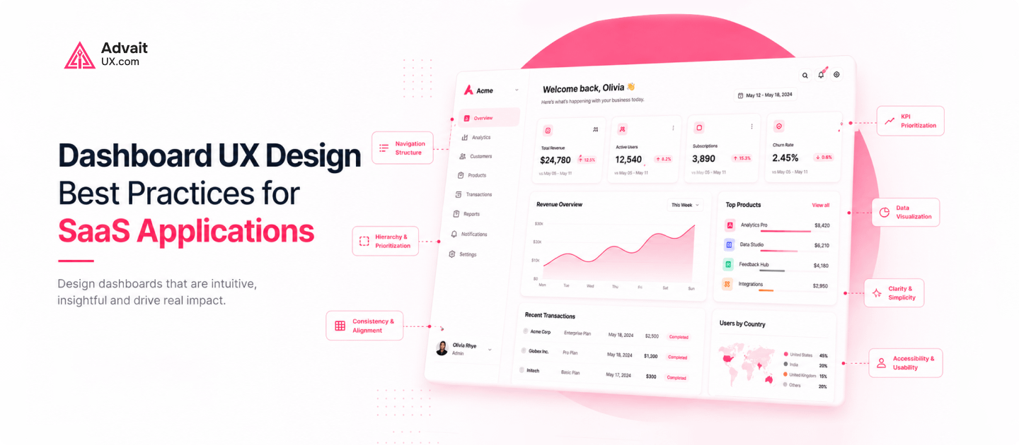
A SaaS dashboard is often the first thing users see every day. Its design decides whether people feel confident or confused. This is why a clear UX strategy matters.
Many teams treat dashboard design as a purely visual task. In reality, it shapes how users think and act. A skilled UI/UX designer treats every screen as a working tool, not decoration.
This guide breaks down the core principles, psychology, and trends behind great SaaS dashboards. It also explains why working with an experienced UI/UX Design Agency like AdvaitUX can save months of guesswork.
Why UX Design Is Important for SaaS Dashboards
Users abandon products that feel confusing within minutes. Good UX design is important because it removes friction before users notice it. Every extra click or unclear label adds cognitive load.
SaaS dashboards carry a unique challenge. They must show dense information without overwhelming users. Strong UX design solves this by organizing data around real tasks.
Companies that invest early in UX design consulting tend to see fewer support tickets. Users who understand a dashboard instantly need less hand-holding. This reduces onboarding costs and early churn.
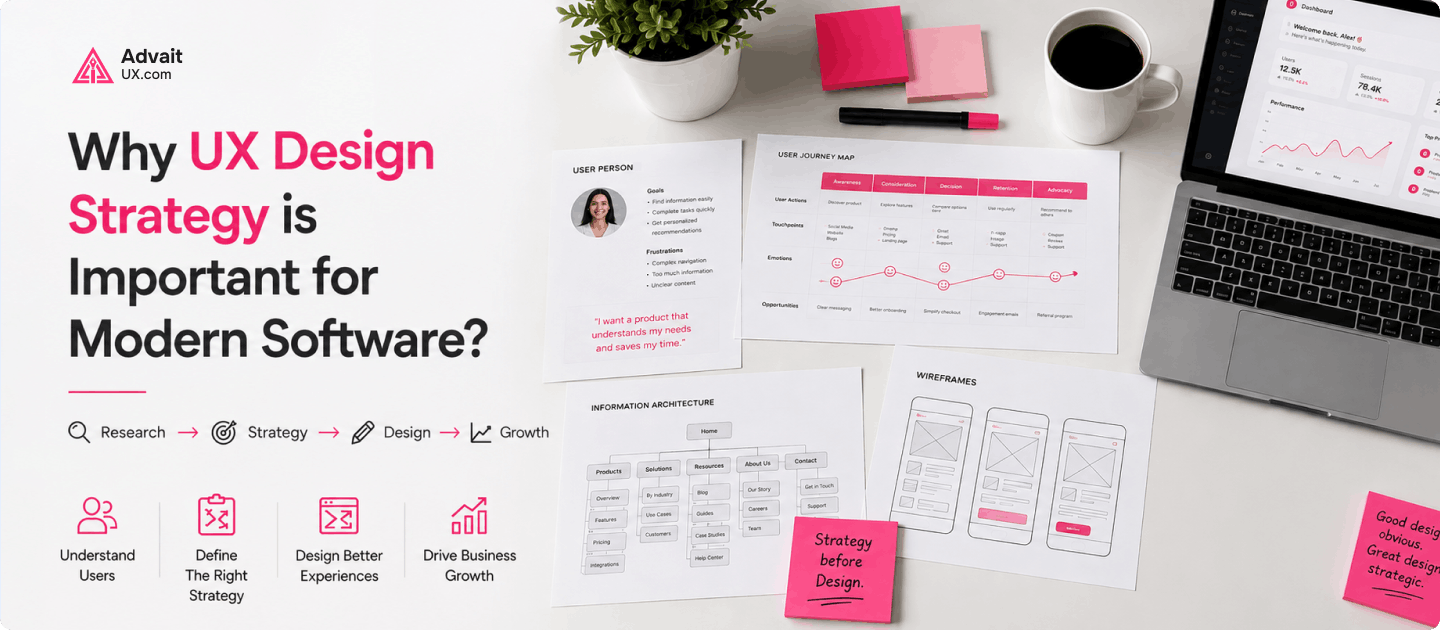
Building a UX Strategy Before You Design Anything
A UX strategy is the foundation every dashboard should start from. It defines the users, the tasks that matter most, and how success gets measured. Skipping this step usually leads to expensive redesigns.
Good UX strategy work starts with research, not wireframes. Interviews, support tickets, and analytics reveal where users actually struggle. This evidence should guide every decision that follows.
AdvaitUX builds UX strategy around business goals as much as user needs, aiming for dashboards that support growth metrics like retention and expansion revenue.
Core Principles of UX Design for Dashboards
A few principles of UX design apply to almost every dashboard. Simplicity keeps screens focused on what users need right now. Consistency means similar actions always look and behave the same way.
Visual hierarchy guides the eye toward what matters most first. Key numbers and alerts should stand out clearly. Secondary details can sit further down or behind a click.
Accessibility is not optional for modern products. Color contrast, keyboard navigation, and screen reader support should be built in from the start. The Web Content Accessibility Guidelines from W3C offer a reliable benchmark for this.
The Role of Psychology in UX Design
Psychology in UX design explains why some dashboards feel effortless. Recognition is easier than recall, so familiar icons reduce mental effort. Users should rarely need to guess what a button does.
Progressive disclosure is another psychological principle worth applying. Show users only what they need at each step, then reveal more on demand. This prevents a dashboard from feeling overwhelming.
Small details build trust over time. Clear feedback after every action, like a saved confirmation, reassures users the system is working. These micro-interactions shape how people feel about a product.
UI Solutions That Improve Everyday Usability
Strong UI solutions turn good strategy into something users can touch. Responsive layouts work well on any screen size, and customizable widgets let users prioritize the data they care about.
Dark mode has moved from trend to expectation for many SaaS products. Smart, non-intrusive notifications keep users informed, and interactive charts let people explore data instead of just viewing numbers.
None of these features matter much without consistent design. A skilled UI/UX designer ties every component back to a shared design system. That consistency builds speed and trust.
UX and UI Design Trends Shaping 2026
UI/UX design trends move fast, but a few stand out this year. AI-powered personalization adjusts dashboards based on how each user actually works. Predictive elements surface likely next steps before users even ask.
Minimalist interfaces continue gaining ground over cluttered screens, and subtle motion design helps users understand state changes without extra text. Data storytelling turns raw numbers into a narrative people can act on.
These trends only work when grounded in solid UX and UI design fundamentals. Chasing trends without strategy creates confusion, not clarity. The best teams adopt new patterns carefully, not all at once.
How UX and UI Design Impact Business Outcomes
The UX and UI design impact on a SaaS business is measurable. Better onboarding flows shorten time to first value. Clearer dashboards reduce the number of support tickets a team handles.
Retention improves when users find value without unnecessary frustration, and conversion rates on key actions like upgrades often rise after a thoughtful redesign.
Leadership teams increasingly track UX metrics alongside revenue metrics, reflecting how closely design quality and business performance connect.
Why a UX Design Audit Matters Before a Redesign
A UX Design Audit identifies problems before they become expensive mistakes. It reviews navigation, accessibility, conversion paths, and overall usability with fresh eyes. This step often uncovers issues teams stopped noticing.
Audits combine heuristic review with real user testing, since watching users struggle with a flow reveals more than internal opinions ever will.
AdvaitUX offers UX design audit services for SaaS teams preparing for a redesign, with clarity on what to fix first rather than a long, unprioritized list.
Choosing the Right UI/UX Design Agency
Picking a UI UX design agency is a long-term decision, not a one-off project. Look for a team that explains its reasoning, not just visuals. Strong agencies show real research behind every decision.
A reliable UI/UX design agency should offer research, prototyping, usability testing, and ongoing support, since one-off deliverables rarely solve problems caused by unclear strategy.
AdvaitUX works as an extension of in-house product teams rather than an outside vendor. This keeps design decisions tied closely to real business goals and honest user feedback.
Achieving UX UI Mastery Through Continuous Improvement
UX UI Mastery is never a finished state. It comes from continuous testing, A/B experiments, and regular customer interviews. Teams that treat design as ongoing work outperform those treating it as a one-time project.
Analytics should inform every iteration, not just intuition, since watching where users drop off reveals exactly where to focus next.
This mindset separates good dashboards from great ones. Great dashboards evolve alongside their users instead of staying static after launch.
Frequently Asked Questions
What makes SaaS dashboard UX different from regular website design?
SaaS dashboards handle dense, real-time data and repeat daily use, unlike a typical marketing website.
How long does a UX design audit usually take?
Most audits take two to four weeks, including heuristic review, user testing, and a prioritized findings report.
Can good UX design really reduce churn?
Yes. Confusing dashboards are a common reason users abandon SaaS products, and clearer design helps users reach value faster.
How do I know if I need a UI/UX design agency?
If your team lacks dedicated design resources or strategy, an agency like AdvaitUX can fill that gap.
What is the first step in working with AdvaitUX?
Most engagements start with a short discovery call, followed by a recommended UX design audit or strategy engagement.
Conclusion: Building Dashboards Users Actually Trust
Great SaaS dashboards combine UX strategy, sound design principles, and a clear understanding of user psychology. None of these elements work well in isolation.
Teams that invest in research, testing, and iteration build products people return to without friction.
If your SaaS dashboard needs a fresh look or a clearer UX strategy, AdvaitUX can help. Contact AdvaitUX through advaitux.com to start with a UX design audit or a strategy consultation.