Key Takeaways
- Logistics buyers now research and shortlist vendors online before ever making contact, making the website a genuine part of the sales funnel.
- Navigation should be organized around what buyers need, not around internal department structure.
- Quote request forms perform best when kept short, with additional detail collected in a follow-up step.
- Service pages need specific, concrete detail — vague claims of “comprehensive solutions” don’t move serious buyers forward.
- Trust signals — certifications, reviews, case studies, client logos — need to be prominent, not buried.
- Mobile UX is an operational concern in logistics, not just a design preference, given how often the industry works away from a desk.
- Dashboard and portal UX directly affects daily usability for both customers and internal teams, and deserves the same attention as the public-facing site.
- SEO and UX reinforce each other — clear structure, fast performance, and genuine usefulness benefit both search visibility and conversions.
- AI is beginning to shape logistics UX through predictive tools, chatbots, and personalization, but the fundamentals of clarity and trust still matter most.
- Fixing the basics — navigation, forms, trust signals, mobile performance — delivers most of the value before any full redesign is needed.
A freight broker comparing carriers doesn’t have time to figure out your website. If your homepage buries pricing information behind three menu clicks, or your quote form asks for eighteen fields before showing a single number, they’ll open a competitor’s tab and never come back. That’s the reality logistics companies are competing in now, whether their internal teams have caught up to it or not.
For a long time, logistics websites got away with being purely informational — a digital brochure sitting next to the phone number that actually closed deals. That era is over. Shippers, procurement teams, and supply chain managers now research and shortlist vendors online before a sales call ever happens, and they’re comparing your site against the cleanest, fastest B2B software they used yesterday, not just against other freight companies. A cluttered, outdated, or confusing website doesn’t just look unpolished. It quietly signals that the operations behind it might be just as disorganized.
This guide covers what actually works in logistics website design — grounded in how the industry’s specific users think, what they need to accomplish, and where most logistics sites lose them. It’s written for logistics companies, freight forwarders, 3PL providers, trucking businesses, and warehouse operators who want their website to function as a real growth channel, not just a placeholder.
Why UI/UX Matters for Logistics Websites
First impressions. Most B2B buyers form an opinion about whether to keep exploring a site within the first few seconds. In an industry where reliability is the entire value proposition, a site that looks dated or amateurish undercuts the message before a single word gets read.
Building trust. Logistics decisions carry real operational risk — a bad carrier choice can mean missed deliveries, damaged goods, or blown deadlines. Buyers are looking for reasons to feel confident before they’ll pick up the phone, and a well-designed website is one of the fastest ways to earn that confidence at scale.
Lead generation. For most logistics companies, the website is a core part of the sales funnel, not a supporting document. Poor navigation, weak calls to action, or clunky quote forms directly translate into fewer qualified leads reaching the sales team.
Customer experience. Existing customers rely on the site too — for tracking shipments, accessing documents, or logging into a portal. A frustrating experience here doesn’t just annoy people; it generates support calls and erodes the relationship you already worked to build.
Operational efficiency. Well-designed dashboards and self-service tools reduce the manual work required from your own team. Every task a customer can complete without a phone call is time your staff gets back.
Digital transformation. Logistics as an industry has been investing heavily in digitizing operations — tracking, routing, inventory visibility — and the customer-facing website needs to reflect that same level of sophistication, or it creates a jarring gap between what the company actually does and how it presents itself.
Understanding Logistics Website Users
Logistics websites serve a wider mix of visitor types than most B2B categories, and each group arrives with different goals.
Shippers. Usually looking to compare pricing, service areas, and capabilities quickly. They want clear answers about whether you handle their type of freight, lane, or volume — fast, without a sales call required just to get basic information.
Freight brokers. Often comparing multiple carriers side by side under time pressure. They value speed, clear capacity information, and straightforward ways to request a quote or check availability.
Supply chain managers. Typically evaluating a longer-term partner, not a one-off shipment. They’re looking for evidence of reliability, scalability, and technology maturity — case studies, integration capabilities, and service consistency matter more here than price alone.
Procurement teams. Focused on vendor vetting: certifications, compliance documentation, insurance coverage, and company stability. They need this information easy to find, since it’s often required before a deal can even move forward internally.
Warehouse operators. Frequently researching specific capabilities — storage capacity, fulfillment speed, technology integrations — and want detailed service pages rather than generic marketing language.
Enterprise buyers. Usually involve multiple stakeholders and longer sales cycles. They need content that supports internal buy-in: clear differentiation, proof points, and resources that are easy to share with colleagues.
Existing customers. Coming to the site for practical, recurring needs — tracking a shipment, accessing an invoice, logging into a portal. Nothing frustrates a current customer faster than a self-service tool that doesn’t work smoothly.
Job seekers. Often overlooked, but a meaningful visitor segment for an industry facing persistent driver and warehouse staffing shortages. A buried or outdated careers page is a missed recruiting opportunity.
Essential UI/UX Best Practices for Logistics Websites
Clear navigation. Menus should map to how visitors think about your services — by mode, by industry, or by capability — rather than by internal business unit names that only make sense to your own team.
Logical information architecture. With services, industries, and resources often numbering in the dozens, a clear hierarchy keeps the site navigable instead of turning into a maze. Group related content together and avoid making users guess which category something falls under.
Mobile-first design. A growing share of logistics research and even quote requests happens on mobile, particularly from operations staff checking things on the move. Human-Cantered Design for smaller screens first tends to produce cleaner results than retrofitting a desktop-first layout.
Fast loading speed. Logistics sites often carry heavy imagery, embedded maps, and tracking widgets that can slow pages down significantly. Every extra second of load time increases the chance a time-pressed visitor bounces before seeing what you offer.
Accessibility. Procurement and enterprise buyers increasingly expect vendors to meet accessibility standards as part of due diligence, and a genuinely accessible site also serves a wider range of users across your own customer base.
Readability. Logistics involves technical terminology, but that doesn’t mean every page needs to read like a compliance document. Clear, concise language, especially on service pages, helps non-specialist buyers understand what you actually do.
Clean layouts. Dense, cluttered pages are common in logistics web design, often because teams try to cram every capability onto one screen. Prioritizing what matters most and giving content room to breathe consistently improves comprehension and conversion.
Consistent branding. Visual and messaging consistency across the site, sales materials, and any customer portals reinforces the sense of a stable, professional operation — which matters enormously in an industry built on reliability.
Homepage Design Best Practices
The logistics homepage has a harder job than most: it needs to communicate credibility to procurement teams, urgency to shippers, and technical depth to supply chain managers, often within the same thirty seconds.
Clear value proposition. Visitors should understand within seconds what you move, where, and for whom. Vague statements like “your trusted logistics partner” say nothing that differentiates you from every competitor using the same phrase.
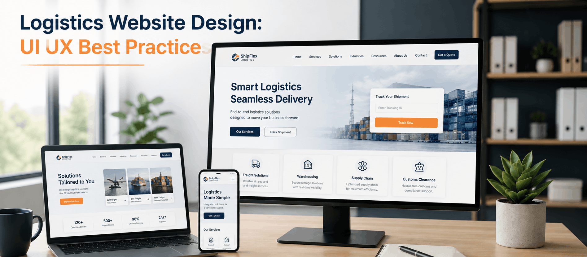
Strong hero section. The hero should combine a specific value proposition with a clear next step, rather than a generic stock photo of a truck and a tagline that could belong to any company in the industry.
Trust indicators. Certifications, years in business, safety ratings, and client counts, placed prominently rather than buried in the footer, help establish credibility before a visitor has read a single service description.
Certifications. Industry-specific certifications and compliance credentials matter more in logistics procurement than in most B2B categories. Displaying them clearly can shortcut vendor vetting conversations that would otherwise happen later, over email.
Client logos. Recognizable client names — where you have permission to display them — provide fast social proof, especially useful for buyers comparing multiple providers who may not have time to read full case studies upfront.
CTA placement. “Get a Quote,” “Track a Shipment,” and “Contact Sales” often serve different audiences. Placing the right CTA prominently for each visitor type, rather than a single generic “Contact Us” button, improves both usability and conversion.
Service overview. A concise, well-organized summary of core services — freight forwarding, warehousing, last-mile delivery — helps visitors self-identify quickly and navigate to the specific page relevant to their need.
Service Pages That Convert
Generic service pages are one of the most common weaknesses in logistics web design — pages that describe “comprehensive solutions” without ever explaining what a buyer actually gets.
Freight forwarding. Buyers want specifics: modes handled, regions covered, documentation support, and how you manage exceptions like customs delays. Vague claims of “global reach” without concrete detail rarely move a serious buyer forward.
Transportation. Fleet size, service areas, tracking capabilities, and equipment types belong front and center. Shippers comparing carriers are often looking for a quick disqualifying detail — the absence of that information just sends them elsewhere to find it.
Warehousing. Storage capacity, location advantages, technology integrations, and fulfillment speed are the details that actually influence a decision. Photos of a clean, organized facility do more here than another paragraph of marketing copy.
Last-mile delivery. Speed, coverage area, and tracking transparency are the differentiators buyers care about most. If real-time tracking is part of the offering, showing a preview of that experience on the service page builds tangible confidence.
Supply chain management. This service tends to be the hardest to explain clearly. Concrete examples — a simplified case study or a visual process diagram — communicate value far better than abstract descriptions of “end-to-end visibility.”
Customs brokerage. Compliance expertise and documentation support are the core value here. Clear explanations of the process, paired with credentials and experience, do more to reassure buyers than generic reassurances of “hassle-free clearance.”
Designing Better Quote Request Forms
The quote request form is often the single highest-value conversion point on a logistics website, and it’s also where the most leads quietly get lost.
Short forms. Every unnecessary field reduces completion rates. Start with only what’s needed to generate a meaningful initial quote — shipment type, origin, destination, and volume are usually enough for a first pass.
Progressive disclosure. Detailed specifics can be gathered in a follow-up step or a sales conversation, rather than front-loaded into the initial form. Asking for everything upfront overwhelms visitors who just want a ballpark answer.
Validation. Real-time validation catches formatting errors — an incomplete zip code or malformed phone number — before submission, preventing frustrating rejections after the form has already been filled out.
Multi-step forms. Breaking a longer quote request into two or three short steps, with visible progress, tends to outperform a single dense page, particularly for freight forwarding or customs-related quotes that genuinely require more detail.
Mobile optimization. Quote forms need to work cleanly on mobile devices, with appropriately sized input fields and minimal typing required — dropdowns and toggles over free-text fields wherever possible.
Confirmation messages. A clear confirmation that sets expectations — what happens next, and roughly when — reduces anxiety and follow-up inquiries, and reinforces the sense of a well-run operation from the very first interaction.
Logistics Dashboard UX Best Practices
For companies offering customer portals or internal operations dashboards, UX quality directly affects daily usability for people who may be logging in dozens of times a week.
Shipment tracking. Tracking interfaces should surface status, location, and estimated arrival clearly, without requiring users to dig through multiple screens to find basic information they check constantly.
Analytics. Reporting features should highlight what matters most to the specific user role — a warehouse manager and a procurement lead need different views of the same underlying data.
Notifications. Proactive alerts for delays, exceptions, or status changes reduce the need for customers to manually check the dashboard, and they meaningfully cut down on “where’s my shipment” support inquiries.
KPIs. Dashboards should lead with the metrics users check most frequently — on-time delivery rate, active shipments, exceptions — rather than burying them beneath less relevant data.
Fleet management. For internal-facing tools, real-time vehicle location, route status, and driver information need to be scannable at a glance, especially for dispatch teams working under time pressure.
Inventory visibility. Warehouse and inventory Dashboard UX Design should make stock levels and movement easy to interpret quickly, since operational decisions often depend on fast, accurate reads of this data.
Data visualization. Charts and visual summaries help users spot trends and outliers far faster than dense tables of raw numbers, particularly for recurring reports that get checked often.
User permissions. Different roles — dispatchers, warehouse staff, customer service, executives — need different views and access levels. Designing permission-aware dashboards from the start avoids a cluttered, one-size-fits-all interface later.
Mobile UX for Logistics Websites
Logistics operations happen around the clock, often away from a desk, which makes mobile UX a genuine operational concern rather than just a nice-to-have.
Responsive design. Pages need to adapt fully to mobile screens rather than shrinking a desktop layout, particularly for data-heavy pages like tracking and service comparisons.
Mobile navigation. Menus should collapse cleanly into an accessible mobile format without hiding the actions people need most — quote requests, tracking, and contact information should never be more than a tap or two away.
Thumb-friendly interfaces. Buttons, form fields, and links need adequate size and spacing for one-handed use, especially given how often logistics professionals check sites while multitasking in a warehouse, cab, or dock.
Fast performance. Mobile users, particularly drivers and field staff, are often on inconsistent connections. Lightweight pages and optimized assets prevent frustrating load times during time-sensitive checks.
Mobile forms. Quote and contact forms need mobile-appropriate input types — number pads for phone fields, dropdowns instead of free text where possible — to reduce the friction of typing on a small screen.
Tracking experience. For customers checking shipment status on the go, a clean, fast, mobile-optimized tracking page is often the most-used feature on the entire site, and deserves UX attention proportional to that usage.
Trust Signals That Increase Conversions
Trust is the deciding factor in most logistics vendor decisions, and a website has limited real estate to build it before a buyer moves on.
Customer reviews. Third-party reviews and ratings provide independent validation that your own marketing copy can’t replicate, especially valuable for buyers evaluating an unfamiliar provider.
Testimonials. Specific, detailed testimonials — mentioning the actual problem solved — carry far more weight than generic praise about being “professional and reliable.”
Certifications. Safety ratings, industry certifications, and compliance credentials matter more in logistics than almost any other B2B category, and should be genuinely easy to find, not buried in a footer link.
Security badges. For sites handling customer data or offering login portals, visible security indicators reduce hesitation, particularly for enterprise buyers running vendor security assessments.
Case studies. Detailed case studies that walk through a real challenge and outcome do more to build confidence than broad claims of expertise, especially for supply chain management services that are hard to explain abstractly.
Industry awards. Recognitions from credible industry sources provide a form of social proof that’s difficult to fake and easy for buyers to quickly verify.
Client logos. Recognizable clients, displayed prominently, offer fast, low-effort validation for time-pressed buyers scanning multiple vendor sites in a single sitting.
Success metrics. Concrete numbers — on-time delivery rate, years in operation, shipment volume — give buyers something tangible to evaluate, rather than vague assurances of quality.
Common Logistics Website Design Mistakes
Confusing navigation. Menus structured around internal departments instead of buyer needs force visitors to guess where information lives. The fix is reorganizing around how customers actually think about your services.
Slow loading pages. Heavy, unoptimized images and embedded widgets are common culprits in logistics sites specifically. Compressing assets and auditing page weight regularly prevents this from quietly costing conversions.
Poor CTA placement. A single buried “Contact Us” link isn’t enough for a site serving multiple buyer types with different needs. Clear, differentiated CTAs throughout the site — quote, track, contact — perform significantly better.
Cluttered layouts. Trying to communicate every capability on every page overwhelms visitors. Prioritizing the most relevant information per page, with clear paths to more detail, improves both clarity and conversion.
Generic messaging. Vague language like “reliable, efficient, and cost-effective” could describe any logistics company. Specific, differentiated messaging tied to real capabilities performs far better with informed B2B buyers.
Weak service pages. Thin service pages that don’t answer buyers’ actual questions push visitors to leave and search elsewhere for detail. Each service page should function as a genuine resource, not a placeholder.
Outdated design. A dated visual style subtly signals an outdated operation, even when the underlying business is modern and well-run. Visual design is doing more reputational work than most logistics companies realize.
Lack of trust signals. Sites that don’t surface certifications, reviews, or proof points make buyers do extra work to feel confident — work that a competitor’s better-designed site has already done for them.
Poor mobile experience. A desktop-only mindset excludes a meaningful share of logistics professionals who research and even initiate contact from mobile devices, often outside a traditional office setting.
AI and the Future of Logistics Website Design
AI-powered search. As buyers increasingly use AI tools to research vendors, logistics companies need content that’s structured clearly enough for these tools to accurately summarize — plain-language service descriptions matter more than ever.
Predictive UX. Some logistics platforms are beginning to anticipate user needs — surfacing likely next actions based on shipment history or account patterns, reducing the number of steps needed to complete routine tasks.
Chatbots. AI-assisted chat can handle routine questions like tracking status or basic service inquiries, freeing human sales and support teams for more complex conversations that genuinely need a person.
Personalization. Returning customers or account holders increasingly expect tailored dashboards and recommendations based on their shipping patterns, rather than a generic, one-size-fits-all interface.
Shipment recommendations. Some platforms are starting to suggest optimal routing or carrier options based on historical data, shifting from purely informational tools to genuinely decision-support systems.
Smart dashboards. AI-driven anomaly detection — flagging unusual delays or exceptions automatically — is becoming a meaningful differentiator for logistics companies offering customer-facing tracking tools.
AI analytics. Predictive analytics around delivery times, capacity planning, and demand forecasting are increasingly expected features in logistics dashboards, not just competitive extras.
How Thoughtful UX Design Helps Logistics Companies
Most logistics companies have deep operational expertise but limited in-house design capability, which means their websites often reflect years of incremental additions rather than a deliberate strategy. A thoughtful, research-driven UX process changes that — mapping the site around actual buyer journeys, simplifying complex service offerings into clear language, and turning dashboards into tools people actually want to use rather than tolerate. This is where a design partner like AdvaitUX tends to add the most value: not by making a logistics site look more modern for its own sake, but by identifying exactly where confusion, friction, or missing trust signals are quietly costing leads, and fixing those systematically rather than through one-off tweaks.
Final Thoughts
The logistics industry runs on precision — exact routes, exact timing, exact documentation. It’s worth holding the website to the same standard. A confusing quote form or a vague service page isn’t a minor cosmetic issue; it’s an operational leak, quietly costing leads and reinforcing doubt in an industry where buyers are already primed to worry about reliability.
Companies that treat their website as seriously as they treat their fleet or their warehouse operations tend to see it pay off in a very specific way: more qualified leads reaching sales, fewer support calls from confused customers, and a digital presence that actually reflects the operational discipline happening behind it.
Traditional Logistics Website vs. Modern UX-Focused Website
| Factor | Traditional Logistics Website | Modern UX-Focused Website |
|---|---|---|
| Navigation | Organized by internal department | Organized by buyer need and service type |
| Speed | Slow, image-heavy pages | Optimized, fast-loading across devices |
| User Experience | Static, brochure-style content | Interactive, task-oriented design |
| Mobile Usability | Desktop-first, poorly adapted | Mobile-first and fully responsive |
| Lead Generation | Long, generic contact forms | Short, purpose-built quote forms |
| Conversion Rate | Low, unclear paths to action | Higher, with clear differentiated CTAs |
| Trust | Minimal proof points | Prominent certifications, reviews, case studies |
| Accessibility | Rarely considered | Built in from the start |
Good UX vs. Poor UX in Logistics
| Factor | Poor UX | Good UX |
|---|---|---|
| User Behavior | Visitors bounce quickly, can’t find services | Visitors navigate confidently to relevant pages |
| Business Impact | Fewer qualified leads, more phone-based clarification | More self-qualified leads reaching sales |
| Customer Satisfaction | Frustration with tracking and self-service tools | Smooth, low-effort self-service experience |
| Conversion Performance | High form abandonment, unclear CTAs | Strong form completion, clear next steps |
Homepage Elements Checklist
| Element | Purpose |
|---|---|
| Hero Section | Communicates specific value proposition instantly |
| CTA | Directs different visitor types to the right next step |
| Services | Gives a clear, scannable overview of core offerings |
| Testimonials | Builds credibility through real customer proof |
| Tracking | Provides quick access for existing customers |
| Contact Options | Offers multiple, clearly visible ways to reach out |
| Trust Badges | Reinforces credibility with certifications and awards |
| Footer | Supports navigation with organized secondary links |
Practical Checklists
Logistics Website UX Audit Checklist
- Is navigation organized around buyer needs rather than internal structure?
- Do key pages load quickly on both desktop and mobile?
- Are trust signals (certifications, reviews, client logos) visible without extensive scrolling?
- Does each service page answer specific buyer questions, not just describe capabilities generically?
- Is the quote request form short, clear, and mobile-friendly?
- Does the site meet basic accessibility standards for contrast and keyboard navigation?
Homepage Optimization Checklist
- Does the hero section state a specific, differentiated value proposition?
- Are there distinct CTAs for different visitor types (quote, track, contact)?
- Are trust indicators placed prominently, not buried in the footer?
- Is the service overview scannable and easy to navigate from?
- Are client logos or testimonials visible above the fold or shortly after?
Mobile UX Checklist
- Does the layout adapt fully to mobile rather than shrinking desktop content?
- Are primary actions within easy thumb reach?
- Does the site perform well on slower mobile connections?
- Are forms optimized for mobile input (dropdowns, number pads)?
- Is the tracking experience fast and easy to use on a phone?
Quote Form Optimization Checklist
- Does the initial form ask only for essential information?
- Is real-time validation in place to catch errors before submission?
- Are longer forms broken into clear, manageable steps?
- Does the form work smoothly on mobile devices?
- Is there a clear confirmation message explaining next steps?
Conversion Optimization Checklist
- Are CTAs differentiated by visitor type rather than generic?
- Have unnecessary form fields been removed from key conversion points?
- Are trust signals placed near key decision points, not just on an About page?
- Are service pages specific enough to answer real buyer questions?
- Is funnel performance tracked at each step, not just at final submission?
FAQs
1. What makes a good logistics website?
A good logistics website has clear, buyer-focused navigation, fast performance, specific service descriptions, visible trust signals, and a straightforward quote request process that doesn’t demand unnecessary information upfront.
2. Why is UI/UX important for logistics companies?
UI/UX directly affects lead generation, customer trust, and operational efficiency. A confusing or outdated site drives away buyers who are comparing multiple vendors and generates unnecessary support requests from existing customers.
3. What features should a logistics website include?
Essential features include clear service pages, a short and mobile-friendly quote request form, visible trust indicators, shipment tracking access, and self-service tools for existing customers where applicable.
4. How can logistics websites improve conversions?
Conversions improve by shortening forms, clarifying calls to action for different visitor types, adding specific proof points instead of generic claims, and ensuring the site performs well on both desktop and mobile.
5. How important is mobile responsiveness?
Mobile responsiveness is essential in logistics, where a significant share of research, tracking checks, and even quote requests happens away from a desk, often from field or warehouse staff.
Conclusion
None of this requires a total website overhaul to start paying off. Most logistics sites improve significantly just by fixing the basics: organizing navigation around what buyers actually need, shortening the quote form, replacing vague service descriptions with real specifics, and surfacing the trust signals that are often already sitting in a folder somewhere, unused.
The bigger shift is mental, not technical — treating the website as a working part of the business, not a static brochure that gets touched once every few years. Logistics companies that make that shift tend to notice the difference in ways that show up directly in the numbers that matter: quote requests completed instead of abandoned, support tickets that never needed to happen, and buyers who chose to trust them a little faster than they trusted the competitor’s site sitting open in the next tab.